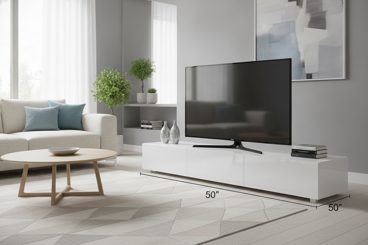
I’ve spent more hours than I’d like to admit staring at 47 browser tabs of media consoles at 2 AM, convinced that if I just find the right one, my living room will finally feel finished. Most of us make the same mistake: we measure the screen, find a stand that matches that number, and call it a day. But then the delivery arrives, you spend three hours with an Allen wrench, and you realize your white 50 inch tv stand looks less like a design choice and more like a precarious balancing act. It’s that moment of 'oh, this looks smaller than I thought' that ruins the vibe.
Quick Takeaways
- The Golden Ratio: Your stand should be at least 6-10 inches wider than your TV screen.
- Visual Weight: White furniture feels lighter than dark wood, so it needs 'grounding' with accessories.
- Finish Matters: Online 'white' can range from hospital-blue to buttery cream; always check swatches.
- The Overhang: If your TV is wider than your stand, it creates a top-heavy 'lollipop' effect that stresses the eye.
The 'Overhang Effect' Is Ruining Your Living Room
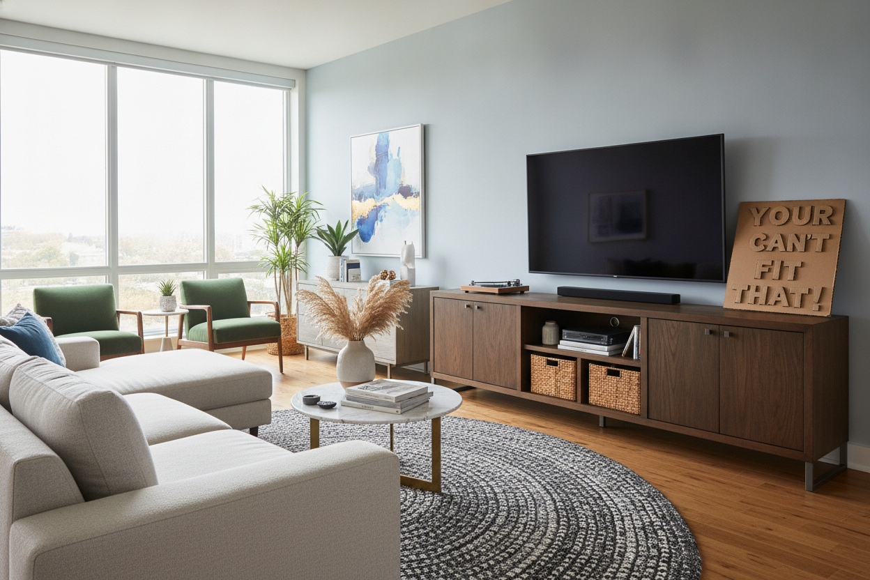
There is a specific kind of visual anxiety that comes from seeing a 55-inch TV perched on a 50-inch console. I call it the 'Overhang Effect.' When the edges of your screen extend past the edges of your furniture, it creates a top-heavy silhouette that makes the whole room feel unstable. Even if the TV technically fits on the surface, the lack of a border makes the screen look like it’s swallowing the wall. It’s the furniture equivalent of wearing a shirt two sizes too small—everything is technically covered, but it looks uncomfortable.
Most people forget that '50 inches' for a TV refers to the diagonal measurement, but for a stand, it’s the literal width. A 50-inch TV is usually about 44 inches wide. If you put that on a 50-inch stand, you only have three inches of clearance on either side. That’s not a margin; that’s a mistake. You want your furniture to act as a frame for your tech, not just a pedestal. Without that breathing room, the stark white of the console gets lost under the black abyss of the screen, making the unit look flimsy and under-scaled for the room's proportions.
How Big Should Your Screen Actually Be for This Size?
If you are committed to a white tv stand 50 inches wide, you need to be honest about your screen size. To get that high-end, custom-built look, your TV should ideally be no larger than 43 inches. This leaves roughly five to six inches of 'runway' on either side of the screen. That space is sacred. It’s where you put a small ceramic vase, a stack of linen-bound books, or simply let the white finish reflect the light. Browsing various Tv Stands can help you visualize how much better a screen looks when it has those side margins to breathe.
When you ignore the 1:1.5 ratio (where the stand is roughly 1.5 times the width of the TV), you end up with a setup that looks accidental. A white finish is particularly unforgiving here. Because white reflects so much light, it can appear 'floaty' or less substantial than a walnut or oak unit. If the TV is too large, it physically and visually crushes the stand. If you’re currently looking at a 55-inch or 65-inch screen, a 50-inch console is simply going to look like a toy. It’s better to size down the tech or size up the furniture than to live with a room that feels permanently out of balance.
Sneaky Ways to Add Visual Weight to a Bright Console
White furniture has a tendency to look like it’s hovering in space, especially if you have light-colored floors. When you add a massive, heavy black rectangle on top, the contrast can be jarring. To fix this, you need to add 'visual weight' to the lower half of the unit. I’ve found that the best way to do this is through texture. Instead of leaving the shelves empty or filling them with plastic DVD cases, use heavy-duty seagrass baskets or a row of dark-covered coffee table books. These darker, tactile elements pull the eye downward and give the unit a foundation.
I've written before about Why Your 55 Inch White Tv Stand Looks Like Dorm Furniture, and the same rules apply here: empty space is your enemy. If your stand has open shelving, don't let it become a graveyard for stray remotes and dust bunnies. A white console needs to feel intentional. By adding items with 'heft'—think marble bookends or a thick wool tray—you counteract the airy nature of the white paint. This makes the entire setup feel like a solid piece of architecture rather than a temporary storage solution. If the bottom feels grounded, the TV on top won't feel like it's about to tip the whole thing over.
Why You Should Probably Go See a White TV Stand in Store First
If I had a dollar for every time a reader told me their 'white' furniture arrived looking like a giant marshmallow or a piece of blue-tinted office equipment, I’d be retired. White is the hardest color to buy online. Digital photos are notorious for blowing out the highlights or failing to capture the undertones. A cool-toned white stand will look absolutely bizarre against warm, creamy walls or oak flooring. This is why I always suggest looking at a white tv stand in store before you commit to the assembly process.
In a showroom, you can see how the paint reacts to different light. Is it a high-gloss lacquer that’s going to show every single fingerprint and speck of dust? Or is it a matte, 'eggshell' finish that feels a bit more sophisticated? You also want to check the 'opacity' of the finish. Cheap white units often have a thin layer of paint where you can see the grain of the MDF underneath, which makes the whole thing look unfinished. If you can’t get to a store, at least order a finish sample. Matching your white furniture to your existing baseboard trim is the secret hack that makes a $300 stand look like a $3,000 custom built-in.
Realizing You Actually Need Something Wider?
Sometimes, you do the math and realize that your 50-inch stand and your 55-inch TV are never going to be friends. If you’ve already measured and realized the proportions are off, don't try to force it. A cramped media wall is one of those things you’ll notice every single time you sit down to watch a movie. If you have the wall space, jumping to a 59 W White Fireplace Heater Tv Stand With Open Shelves Timer solves the width problem and adds the kind of structural weight that a standard thin console lacks.
The extra nine inches of width might not sound like much, but in interior design, those inches are the difference between 'cluttered' and 'curated.' A wider stand allows you to center the TV and still have room for a lamp or a plant on the end, which helps integrate the tech into the rest of your decor. If your room is large enough, don't be afraid to go even wider. The goal is to make the TV look like a part of the room’s story, not the entire plot. When the furniture is wider than the screen, the screen feels like a choice, not a necessity.
Personal Experience: The Glossy Disaster
I once bought a 50-inch high-gloss white unit for my first apartment. I thought it looked 'modern' and 'European.' In reality, it looked like a piece of hospital equipment. The white was so stark and blue-toned that it made my beige rental walls look dirty. To make matters worse, I had a 50-inch TV. The legs of the TV were literally half an inch from the edge of the stand. Every time I vacuumed, I lived in fear of bumping the console and watching $600 of electronics hit the floor. I eventually swapped it for a 60-inch matte unit, and the entire room suddenly felt five feet wider. Proportions matter more than the price tag.
Frequently Asked Questions
Can I put a 50-inch TV on a 50-inch stand?
Technically, yes, because a 50-inch TV is usually only 44 inches wide. However, it will look cramped and top-heavy. It’s better to have at least 3-5 inches of space on each side of the screen.
How do I stop my white TV stand from looking cheap?
Swap the stock hardware! Replacing basic silver knobs with high-quality brass or matte black pulls can instantly make a budget-friendly white console look like a high-end designer piece.
Is a matte or glossy white finish better?
Matte is generally better for hiding dust and fingerprints. Glossy finishes can create annoying reflections from the TV screen and tend to look 'dated' much faster than a soft, satin finish.
Laisser un commentaire
Ce site est protégé par hCaptcha, et la Politique de confidentialité et les Conditions de service de hCaptcha s’appliquent.