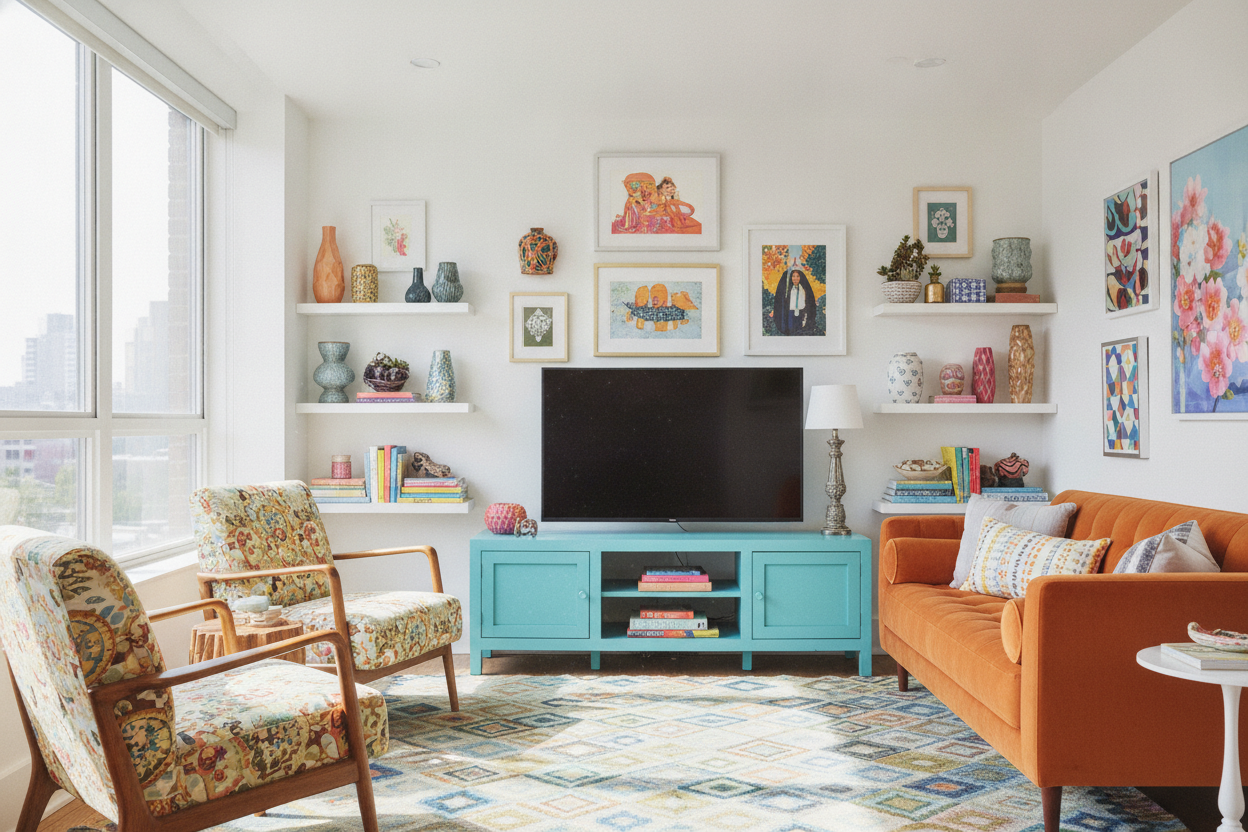
I spent three years curating a living room that looked exactly like a high-end dental office. It was all 'greige' linen and oak-veneer shelves that felt safe but totally lacked a soul. One Tuesday at 2 AM, I realized the missing piece wasn't another neutral throw pillow; it was a bold, unapologetic aqua tv stand.
- Aqua acts as a visual anchor that stops a room from looking like a generic showroom.
- Matte or satin finishes feel much more adult than high-gloss teal.
- Blue tones hide dust significantly better than black glass or dark walnut.
- It works surprisingly well with both warm gold and cool silver hardware.
The 'Millennial Gray' Breaking Point
I was staring at my living room—a sea of oatmeal-colored fabrics and white walls—and I felt nothing. It was the peak of the 'millennial gray' era, where everything is tasteful, timeless, and incredibly boring. My 65-inch television looked like a massive black void sucked into a white wall.
The room needed a focal point that wasn't just a glowing screen. Most people go for a rug or a piece of art, but those are hard to get right when you're on a budget. I wanted something functional that could carry a heavy visual load without making me feel like I lived in a crayon box. I needed a piece with enough weight to ground the room but enough color to wake it up.
Why Colorful Furniture is Safer Than Painting Walls
I've spent too many Saturdays taping off baseboards only to realize the 'perfect' sage green paint looks like pea soup in my specific lighting. Painting is a commitment; buying a piece of furniture is a choice. After browsing endless tv stands that all looked like the same rectangular brown box, I decided to take a risk on a saturated hue.
An aqua console brings that coastal or eclectic energy without the permanence of a gallon of paint. If I move next year, the aqua comes with me. If I get sick of it in five years, I can sand it down and go back to wood. But for now, it provides that hit of personality that makes the room feel lived-in rather than staged by a realtor.
Does Bright Blue Clash With the Big Black Box?
The biggest fear I hear is that a bright color will compete with the TV. In my experience, it's the opposite. A dark wood stand makes the TV look like a giant monolith. A vibrant aqua frame actually softens the transition between the black screen and the wall by giving your eyes something else to focus on.
It's about balancing style and daily function. You want something that looks great when the TV is off, but doesn't distract you during a movie marathon. The aqua creates a boundary that makes the screen feel like a deliberate part of the design, not just an appliance I couldn't hide. When the screen is dark, the console is the star; when the screen is on, the color recedes into a nice frame.
3 Rules for Styling a Brightly Colored Console
To keep a bright piece of furniture from looking like it belongs in a nursery, you have to ground it with textures that feel expensive. Rule one: Add brass or copper. The warmth of the metal cuts through the coolness of the aqua. I swapped the stock plastic handles for heavy brass pulls, and it immediately looked like a custom piece.
Rule two: Use organic textures. I put a chunky jute rug nearby and a few terracotta pots on the shelves. Rule three: Contrast it with tradition. While I love my bold choice, I often recommend a classic mid-century modern tv stand for people who are truly color-phobic. But if you're going for the aqua, lean into the greenery. A large Monstera leaf next to a blue cabinet is a top-tier color combination that feels lush, not loud.
The Verdict: Am I Sick of the Color Yet?
It’s been six months since the delivery truck dropped off my aqua unit, and I haven't regretted it once. Every time I walk into the room, that pop of color makes me smile. It’s the first thing guests comment on, and it makes the rest of my cheap, neutral furniture look like a deliberate design choice rather than a lack of imagination.
My one mistake? I originally tried to pair it with a navy rug. Don't do that—it’s too much blue and starts to feel like a themed hotel room. I switched to a neutral cream rug with a subtle geometric pattern, and the balance was restored. If you're bored with your space, stop buying beige pillows and just buy the blue stand.
FAQ
Will aqua go out of style quickly?
Trends move fast, but shades of blue are about as timeless as color gets. If you keep the lines of the furniture simple and avoid overly 'distressed' finishes, the color will feel fresh for years.
Is it hard to match other decor with aqua?
Not if you treat it like a denim jacket. It goes with almost everything—whites, woods, leathers, and even muted pinks or mustard yellows if you're feeling brave.
What finish should I look for?
Go for a matte or eggshell finish. High-gloss aqua can look a bit like a plastic toy, whereas a flatter finish shows off the depth of the color and allows the light to hit it without creating harsh glares while you're watching TV.
Laisser un commentaire
Ce site est protégé par hCaptcha, et la Politique de confidentialité et les Conditions de service de hCaptcha s’appliquent.