
I spent three hours last night staring at forty-seven browser tabs, trying to find a media console that wouldn't make my living room look like a generic hotel lobby. My eyes hurt, and my cart was full of 'matching' pieces that felt safe, boring, and utterly devoid of life. Choosing the right tv stand color shouldn't feel like a high-stakes chemistry experiment, yet here we are.
- Matching sets make a room look like a showroom floor, not a home where people actually live.
- A TV is a massive black rectangle; your console needs the visual weight to anchor it.
- Mix wood tones by matching the undertones (warm vs. cool), not the specific wood species.
- Dark consoles hide the 'black hole' effect of a turned-off screen better than light ones.
The 'Matching Set' Trap
I've seen it a thousand times: the oak coffee table, the oak side table, and the oak TV stand. It’s the safe choice, but it’s also the fastest way to make your living room feel flat and dated. When people are shopping for new TV stands, the instinct is to play it safe so they don't 'mess up' the design. In reality, a room with zero contrast has no soul.
Real character comes from the pieces you've collected over time. That vintage trunk you use as a coffee table shouldn't be the same species of wood as your media unit. If everything is the same shade of honey oak, nothing stands out. You want your guests' eyes to move around the room, not get stuck in a beige-on-beige loop.
Why Your Media Console Needs to Ground the Room
Let's be honest: a 65-inch television is essentially a giant, sucking void of black glass on your wall. If you put a flimsy, light-colored stand underneath it, the TV looks like it’s floating awkwardly. You need a piece with enough visual weight to balance that heavy black screen. I once tried a thin, pale birch unit and it looked like a toothpick holding up a bowling ball.
Sometimes, brightening a dark living room requires a stark contrast, like a crisp white unit against a navy wall. But generally, the console is the 'foundation' for your tech. If the stand is too light in color or too thin in construction, the whole wall feels top-heavy and unsettled.
The Case for Going Dark (or Black)
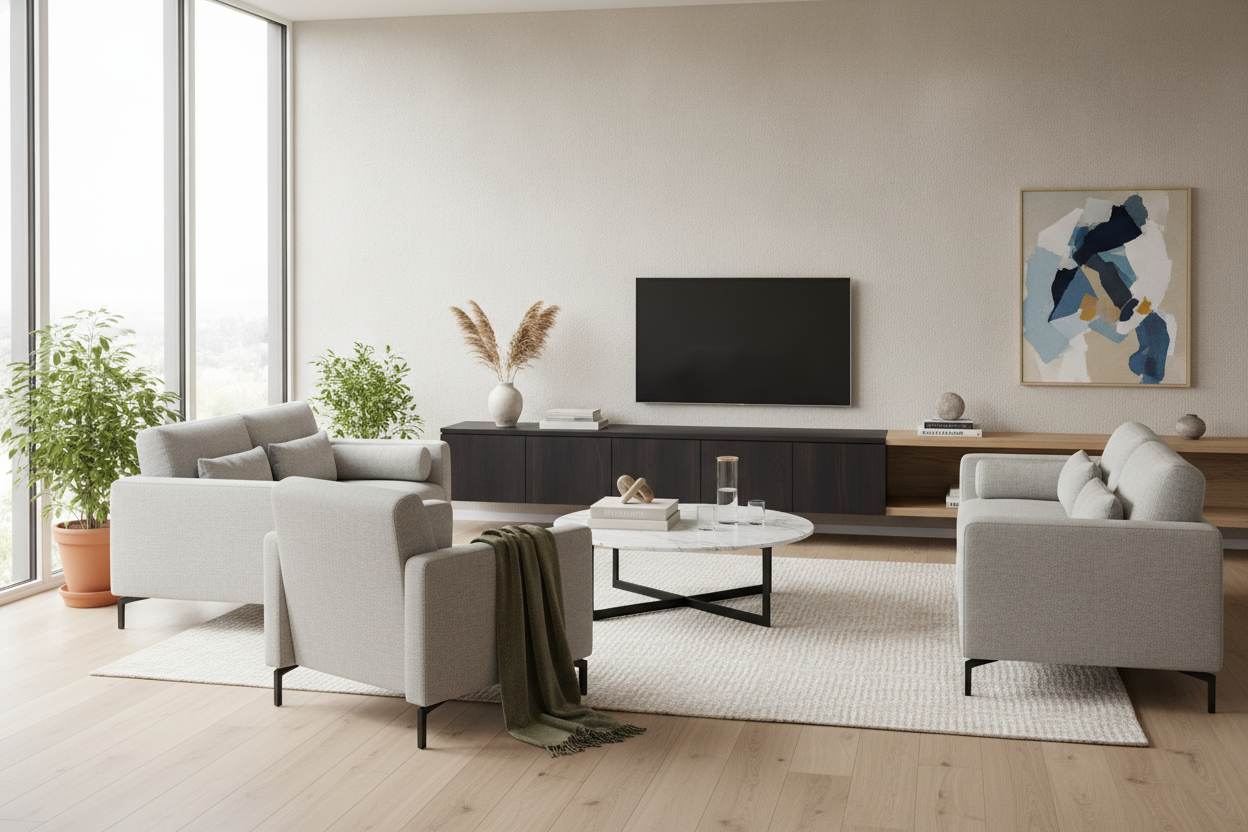
Black or charcoal consoles are my secret weapon. When the TV is off, the screen blends into the furniture rather than screaming for attention. It’s a sophisticated look that hides the inevitable mess of wires and dust better than you'd think. An ebonized oak or a simple matte black finish provides a masculine, sturdy base that makes even a budget TV look like a high-end installation.
When to Use a Bold Accent Hue
If your walls are white and your floor is neutral, why not go for a forest green or a deep navy console? It turns a utility piece into a deliberate focal point instead of just a box hiding your router. Just make sure you're styling a bold color TV stand with some intention—add a few matte ceramics or a stack of linen-bound books to keep it looking like a design choice rather than a playroom leftover.
How to Mix Wood Tones Without Panicking
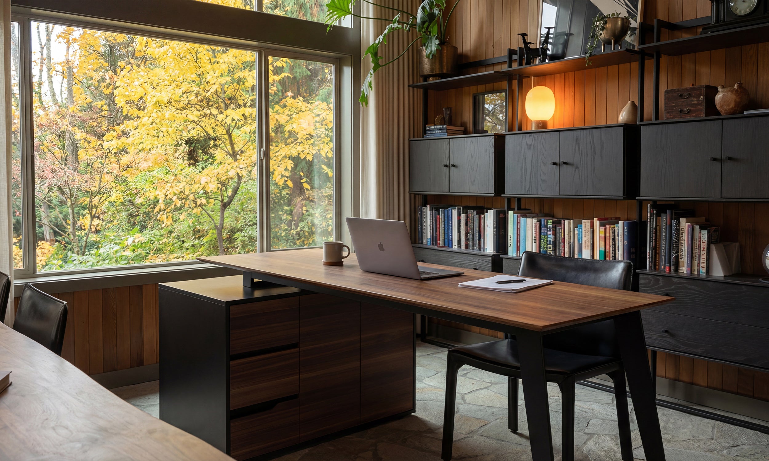
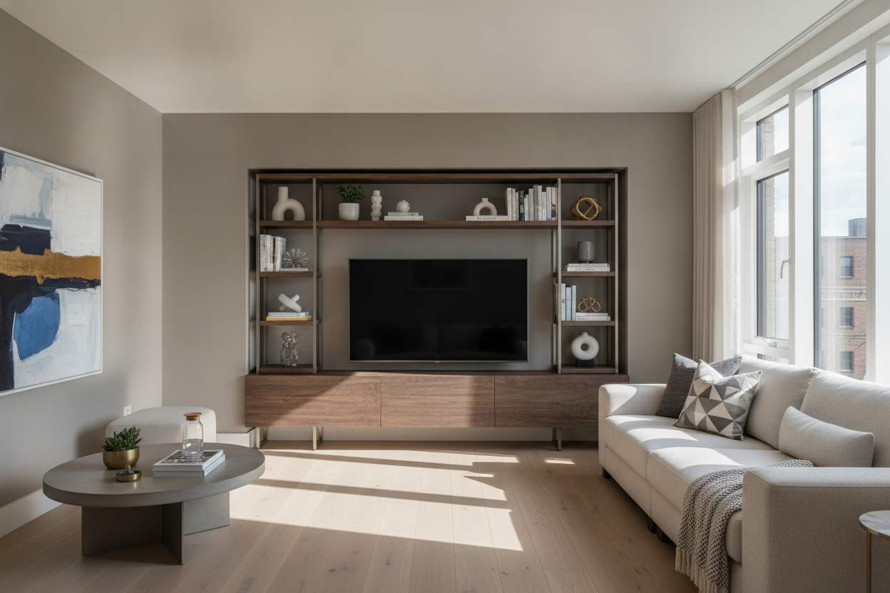
You can absolutely have an oak floor and a walnut console. The trick is identifying the undertone. If your floor has a yellow or orange warmth, stick to other warm woods. This mid-century modern TV stand is a masterclass in this; its rich, warm tones play beautifully against lighter, honey-colored hardwoods without looking like a mistake.
I usually aim for at least two 'steps' of difference in shade. If your floor is a medium-brown hickory, don't buy a medium-brown stand. Go much darker (espresso) or much lighter (whitewashed ash). That intentional gap tells the eye that you mixed these pieces on purpose, not because you couldn't find a match.
My One Rule for Choosing a Finish
Look at your largest piece of furniture—usually the sofa. If it’s a cool grey or blue, go for a cool-toned wood or a black stand. If it’s a warm tan, leather, or beige, lean into those walnuts and oaks. Don't overthink the 'match'; focus on the mood. I once bought a 'matching' set from a big-box retailer because I was tired of making decisions, and within six months, I hated it. The wood grain was identical on every surface, making the room feel like a cardboard box. I eventually sold the coffee table and replaced it with a marble-topped piece, and the room finally breathed.
FAQ
Does my TV stand have to be wider than the TV?
Yes. Always. Ideally, you want at least 6 to 10 inches of breathing room on either side of the screen. A TV that overhangs the edges of the stand looks top-heavy, cheap, and frankly, a bit dangerous.
Can I put a black TV stand on a dark wood floor?
You can, but you'll need a rug to create some separation. Without a rug, the black stand will just disappear into the floor, creating a 'dead zone' in your room's layout.
Should the stand match my wall color?
Only if you are going for a minimalist, built-in look where you want the furniture to 'disappear.' If you want it to look like a curated piece of furniture, choose a color that contrasts with your paint.

Laisser un commentaire
Ce site est protégé par hCaptcha, et la Politique de confidentialité et les Conditions de service de hCaptcha s’appliquent.