I spent three years living in what I affectionately called 'The Cloud.' White walls, white rug, white linen sofa. Then I bought a white media console. Suddenly, my living room didn't feel like a sanctuary; it felt like a surgical suite where I happened to watch Netflix. It was too much of a good thing.
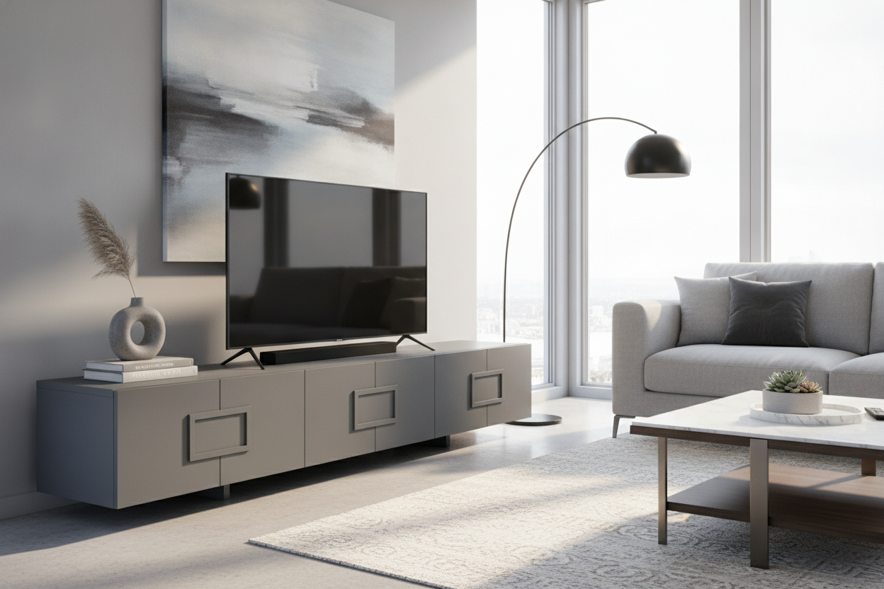
The problem is that white-on-white-on-white lacks tension. Everything just bleeds together until your eyes have nowhere to rest. I eventually realized that swapping that stark unit for a contemporary grey tv stand was the fix I actually needed. It provided the visual weight the room was missing without making it feel like a dark cave.
- Grey hides the inevitable dust bunnies better than high-gloss white or black.
- It bridges the visual gap between a black TV screen and a light-colored wall.
- Ash gray works with warm woods; charcoal suits industrial, moody vibes.
- It feels more 'custom' and less 'dorm room' than basic white furniture.
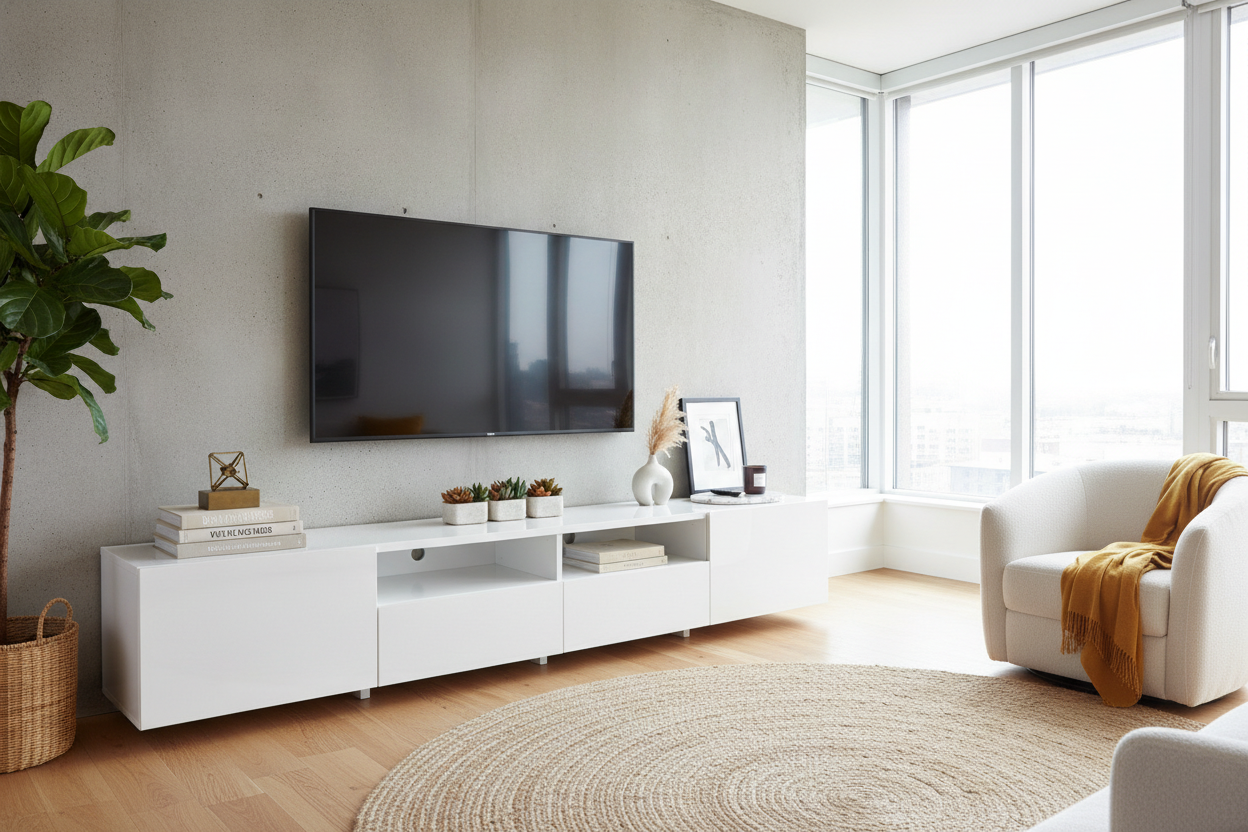
The 'All-White Everything' Fatigue
We've all been seduced by those hyper-minimalist Pinterest boards. But in a real house with real lighting, a monochromatic white setup often backfires. This is why modern white tv stands look cheap—they tend to emphasize every seam, every smudge, and the quality of the laminate rather than the design itself.
When your walls are white and your furniture is white, you lose the sense of depth. Your 65-inch TV ends up looking like a giant black hole floating in space. You need a mid-tone to ground the wall, and grey is the most forgiving option available. It adds a layer of sophistication that pure white simply can't reach because it introduces shadow and contrast.
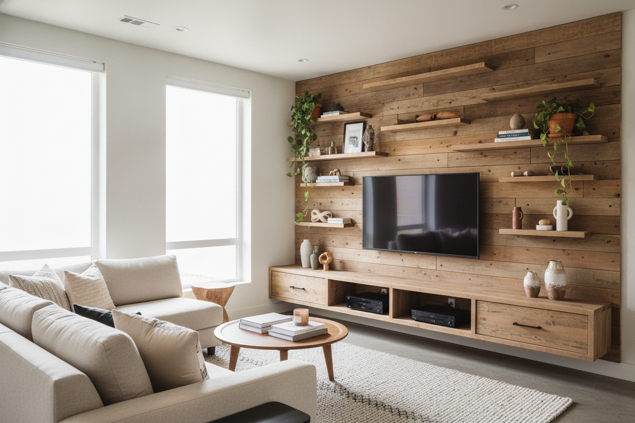
Why a Contemporary Grey TV Stand is the Ultimate Compromise
A grey modern tv stand acts as a visual anchor. Think about it: your TV is a giant black rectangle. Placing it on a white stand creates a jarring contrast that screams for attention. A grey unit softens that blow, acting as a middle ground that lets the screen recede into the room rather than pop out like a sore thumb.
It’s also incredibly practical. I’ve found that grey finishes—especially those with a slight wood grain or matte texture—are remarkably good at hiding the fingerprints that somehow always end up on the doors. If you have kids or a dog that likes to investigate the electronics, you'll thank me later. It’s a neutral that doesn't feel like a default; it feels like a choice.
Finding the Right Tone: Ash Gray vs. Charcoal
Not all greys are created equal. If you have warm oak or honey-toned floors, go for an ash gray tv stand. It has those slight yellow or brown undertones that keep the room from feeling chilly. It feels organic, almost like weathered driftwood, and plays well with other natural materials.
On the flip side, if you’re in a loft with concrete floors or you’ve gone for a cooler color palette, a deep charcoal or slate is the move. It feels intentional and heavy in a good way. Just make sure you have enough light in the room so it doesn't just look like a black blob in the corner at night.
Styling a Grey Modern TV Stand (Without Looking Corporate)
The biggest risk with a modern tv stand grey finish is the 'Cubicle Effect.' If you leave it bare, it looks like it belongs in an HR department. You have to mess it up a little to make it feel like home. Avoid anything that looks too much like a filing cabinet.
I like to throw a trailing pothos on one end to break up the straight lines. Organic shapes are the enemy of corporate vibes. Add some unlacquered brass hardware if you can—the gold tones against the grey are a classic combo. If you’re shopping for something with more character, browse this collection of modern tv stands to find units with fluted doors or slatting that add some much-needed shadow and depth.
Stack a few vintage books with colorful spines next to your soundbar. The pop of color against the neutral grey makes the books look curated, not cluttered. It’s about creating a balance between the tech and the touchable. A few unlacquered brass accents or a ceramic vase can break up the flat surfaces and add a sense of history.
Are We Finally Done With Wood Tones?
We aren't done with wood, but we are definitely seeing a shift away from the 'walnut or bust' mentality. While everyone else is debating what designers think about mid-century modern, a grey unit offers a clean break from the 1960s obsession. It’s a way to be modern without being retro.
It feels current without being trendy. A painted or stained grey finish allows the silhouette of the furniture to speak louder than the grain of the wood. It’s a sophisticated choice for someone who wants their living room to feel like it was designed this decade, not salvaged from a 1954 basement. It gives you the freedom to use wood in other places, like a coffee table or shelving, without it feeling like a forest.
Personal Experience: The 'Blue' Disaster
I once ordered a charcoal unit that looked perfect on my laptop screen. When it arrived and I spent two hours assembling the 18mm MDF panels, I realized it wasn't charcoal at all—it was navy blue in disguise. In the morning light, it looked like a giant blueberry sitting in my living room. It clashed with everything.
My advice? Always check the 'customer photos' section of a listing. Manufacturers love to color-correct their studio shots until the grey looks perfectly neutral, but real-life lighting reveals those sneaky blue or purple undertones. If you can, look for 'true grey' in the reviews or order a swatch. It saved me on my second attempt.
FAQ
Does a grey TV stand show dust?
It’s the goldilocks of furniture. It shows less dust than a high-gloss black unit but slightly more than a light oak. A quick wipe once a week usually keeps it looking crisp and clean.
What color hardware looks best with grey?
Brass or gold adds warmth and a high-end feel. If you want something more industrial, matte black is a safe bet. Avoid silver hardware unless you want it to look like an office filing cabinet.
Will a grey stand make my room feel dark?
Not if your walls are a lighter shade. It actually provides the 'weight' a room needs to feel grounded. Think of it as an accent piece that draws the eye rather than a piece that absorbs all the light.
Laisser un commentaire
Ce site est protégé par hCaptcha, et la Politique de confidentialité et les Conditions de service de hCaptcha s’appliquent.