
I spent three years in a rental with 'eggshell' walls and gray floors. My solution was a walnut media console because, well, that's what grown-ups buy. It looked fine, but it felt like living inside a cardboard box. Then I bought a cobalt blue color tv stand and suddenly the room had a pulse. It turns out you don't need a gallon of paint and a security deposit dispute to fix a boring living room.
- Skip the wood; color adds architecture to a room without needing paint.
- Darker jewel tones like navy and forest green feel more expensive than standard oak.
- A vibrant stand distracts the eye from the 'black hole' effect of a large TV screen.
- Balance a loud piece with neutral textures like wool, jute, or linen.
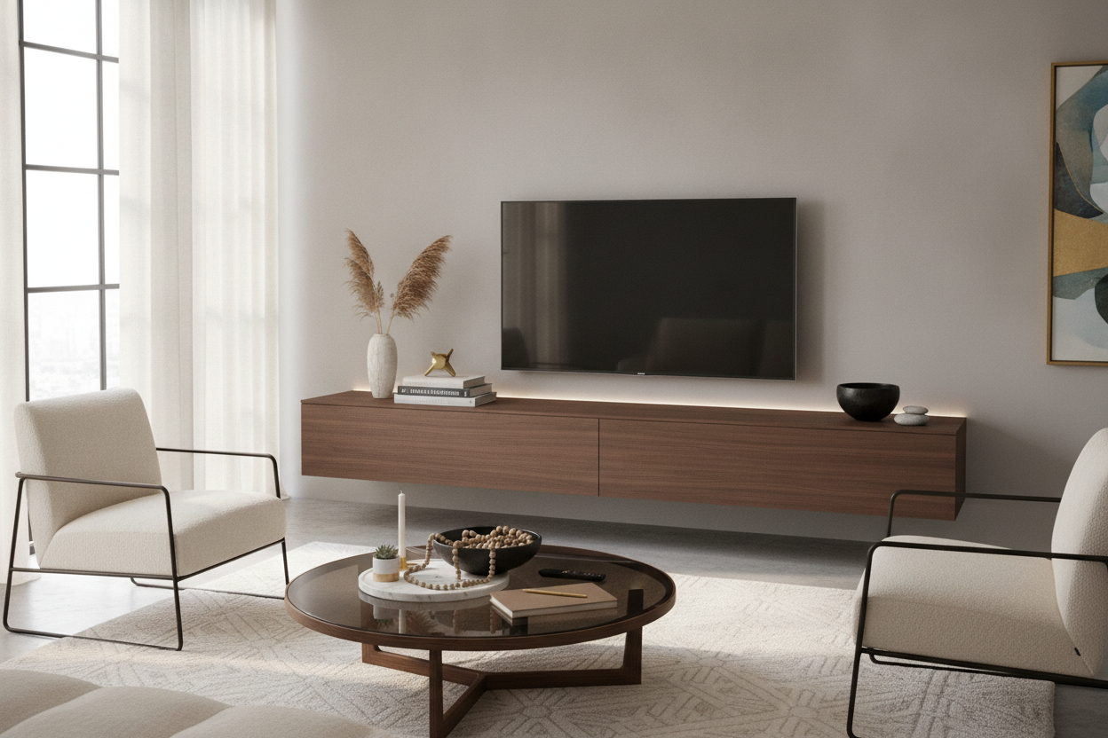
The Tyranny of the 'Safe' Wooden Media Console
Everyone buys the same acorn-finish MCM console. It is the safe bet, the one that won't offend your mother-in-law. But when you are stuck in the middle of the media console versus a traditional credenza debate, you realize most wood options just blend into the floorboards. A coloured tv stand breaks that monotony. It stops the 'sea of brown' that happens when your coffee table, floor, and TV unit all share the same undertone.
I’ve seen too many gorgeous rooms ruined by a lack of confidence. We choose white or wood because we are afraid of making a mistake. But a colorful media console isn't a mistake; it's a focal point. It tells people you actually live there and didn't just move into a showroom. It anchors the room in a way that a 'safe' piece never can.
Why Colorful Entertainment Centers Actually Hide the Screen Better
TVs are inherently ugly. A 65-inch black rectangle is a visual void that sucks the life out of a wall. If you put it on a beige or light wood stand, you are just providing a pedestal for that void. However, a bold color tv console or colored entertainment centers act as a visual anchor. Your eyes are drawn to the matte terracotta or the deep sage finish of the furniture first.
This is a classic design trick: use a high-saturation piece to compete with the screen. When the stand has a personality of its own, the TV feels like an accessory to the furniture, rather than the furniture being a slave to the TV. It turns the 'entertainment zone' into a curated corner.
Picking Your Poison: From Moody Greens to Dopamine Brights
Not all coloured tv stands are created equal. You have to decide if you want the piece to whisper or scream. A muted, dusty rose can feel like a neutral if you style it right, while a primary yellow is a loud, proud statement. It’s about the vibe you want to wake up to every morning.
Jewel Tones for the Grown-Up Living Room
If you are worried about your home looking like a playroom, stick to the jewel tones. Deep emeralds, rich burgundies, and midnight blues make unique colorful tv stands look incredibly high-end. A sleek wall-mounted media console in a dark navy blue looks like a custom architectural feature rather than a piece of flat-pack furniture. These colors provide depth and sophistication that wood-look laminates just can't touch.
The High-Contrast Multicolor Approach
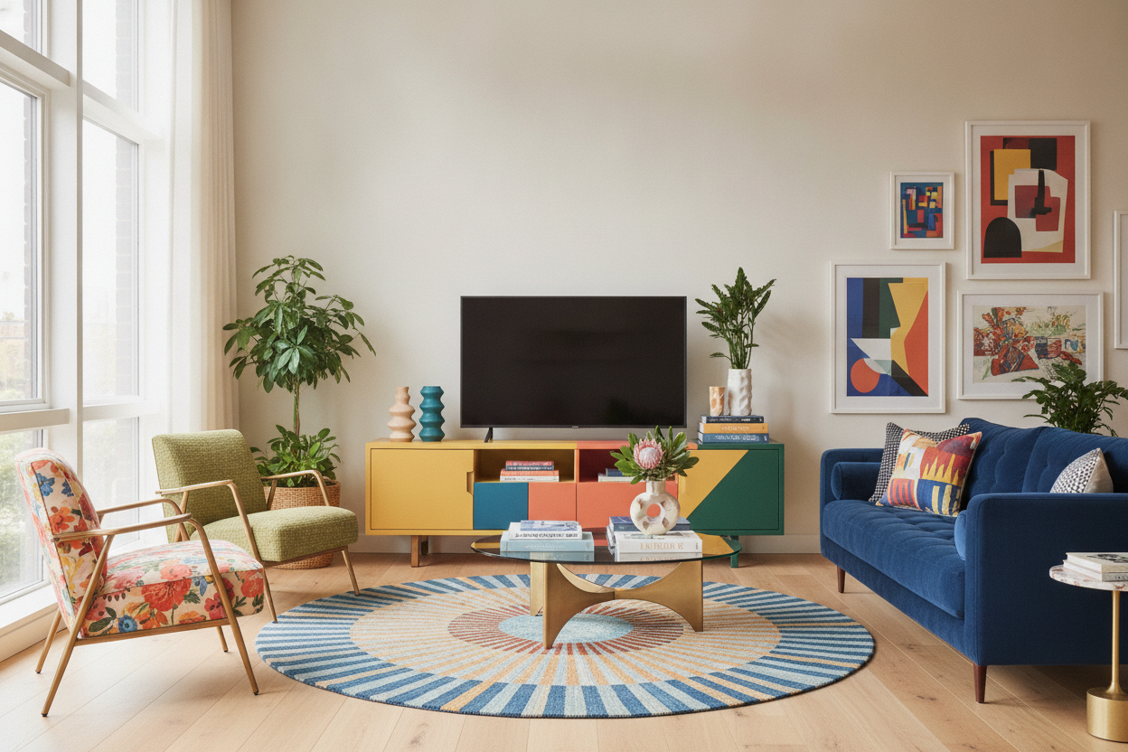
For the brave, a multicolor tv stand or a unit with color-blocked doors is the ultimate move. The key here is to look for sophisticated palettes—think mustard, charcoal, and teal rather than red, blue, and yellow. It adds a layer of playfulness. I’ve found that these pieces work best when the rest of your furniture has clean lines, so the colors don't have to compete with ornate carvings or busy patterns.
How to Style Around a Loud TV Stand
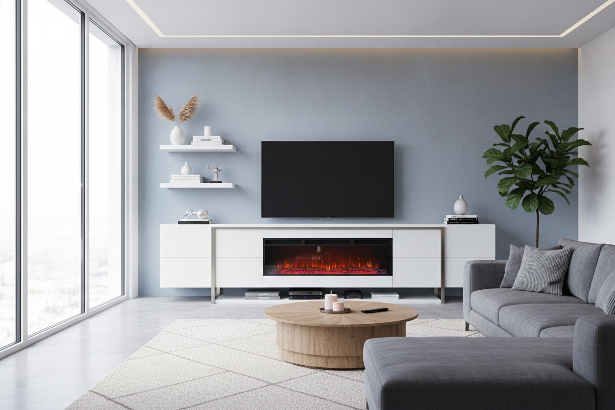
The biggest mistake people make with a colorful media console is trying to match everything to it. Don't do that. If you have a bright orange stand, don't buy orange pillows. Ground the piece with neutrals. A creamy wool rug or a chunky jute texture provides the perfect 'quiet' background for your loud furniture.
Bold colors also pair incredibly well with strong, geometric furniture shapes. For instance, an architectural L-shaped TV stand in a matte forest green creates a silhouette that feels like art. Use matte black lamps or brass hardware to add a 'metal' element that breaks up the color and keeps the look grounded in reality.
Still Scared of Color? The 'Dip Your Toe' Method
If you're still hovering over the 'buy' button on that walnut stand, try a compromise. Look for a wood unit that features just a pop of color on the sliding doors or the interior shelves. Another pro tip: buy an open-back console and line the back panel with a bold peel-and-stick wallpaper. It gives you that colorful tv stand look without the permanent commitment to a single hue.
My Personal Lesson in Boldness
I once bought a 'burnt orange' console that arrived looking more like a traffic cone than a sunset. It was aggressive. Instead of returning it, I swapped the cheap plastic legs for heavy brass ones and put a massive, dark green fiddle-leaf fig next to it. The contrast between the organic green and the industrial orange made the whole room look intentional. It became the most-complimented piece in my house because it looked like I meant to be that bold.
FAQ
Will a colored TV stand show more dust?
Darker colors like navy or black show every speck of dust and every fingerprint. If you hate cleaning, go for a mid-tone like sage green, terracotta, or a dusty blue. They are much more forgiving.
How do I make sure the color doesn't clash with my rug?
Keep the rug neutral or find a rug that has a tiny fleck of the stand's color in its pattern. You want the stand to be the star, not for the floor and the furniture to be screaming at each other.
Does color make a small room look smaller?
Actually, a bold color can make a room feel larger by creating a clear focal point. It draws the eye to a specific spot, which creates a sense of depth and intention in a cramped space.

Laisser un commentaire
Ce site est protégé par hCaptcha, et la Politique de confidentialité et les Conditions de service de hCaptcha s’appliquent.