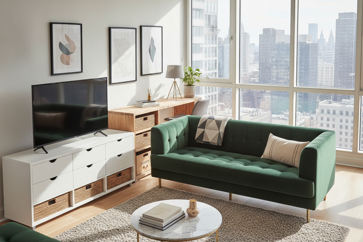
I spent three straight nights staring at my living room floor until 2 AM, feeling like I was losing a fight with a giant pumpkin. My rental has these gorgeous, original 1950s hardwood floors that are—to put it politely—aggressively orange. I did what every Pinterest board told me to do: I bought a walnut console. I thought the 'wood on wood' look was the gold standard, but the result was a disaster. It looked like a muddy, dated mess where nothing popped and everything felt heavy.
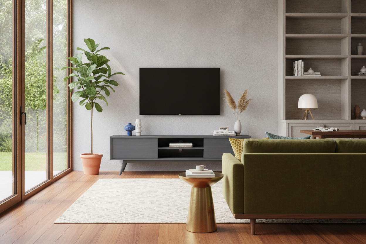
That was the moment I realized I needed to break the rules. I stopped looking for the 'perfect match' and started looking for contrast. Bringing in a gray mid century modern tv stand was the best design audible I’ve ever called. It didn’t just hold my TV; it acted as a cooling agent for the entire room, finally making those orange floors look like a choice rather than a mistake.
Quick Takeaways
- Cool-toned gray acts as a neutral buffer against warm, orange-toned wood floors.
- Matte finishes are essential to avoid the 'cheap plastic' look of high-gloss furniture.
- Tapered legs and a low profile maintain the MCM vibe without the heavy wood-grain overload.
- Physical texture, like slatted doors, replaces the visual interest usually provided by wood grain.
The Problem With the 'All-Walnut Everything' Rule
We’ve been conditioned to believe that if you have a mid-century home, you need walnut furniture. Period. But when you’re shopping for new TV stands, you quickly realize that 'walnut' is a spectrum. Sometimes it’s too red; sometimes it’s too yellow. When you place a warm walnut piece on top of a warm oak floor, the two tones fight for dominance. Instead of a curated look, you end up with a room that feels like the inside of a sweaty cigar box.
My living room felt claustrophobic. The orange in the floor was pulling the red out of the walnut, and the whole space felt like it was vibrating at a high, uncomfortable frequency. I tried rugs, but the wood still peeked through, mocking my attempts at coordination. The issue wasn't the quality of the furniture; it was the lack of visual breathing room. You need a break in the color story to let your eyes rest. If everything is a 'natural' wood tone, nothing actually looks natural—it just looks messy.
I’ve seen this mistake in dozens of apartments. People get so hyper-focused on matching the grain that they forget about the temperature of the room. A gray finish provides a hard stop to the warmth. It creates a boundary. It tells the viewer, 'The floor ends here, and the furniture begins there.' Without that boundary, your expensive console just melts into the floorboards.
Why I Pivoted to a Gray Mid Century Modern TV Stand
I knew I wanted to keep the MCM silhouette. I’m a sucker for those 8-inch tapered legs that make a piece of furniture look like it’s floating. It’s a practical choice for small apartments because you can see the floor underneath, which tricks your brain into thinking the room is bigger. But I needed a color that wasn't trying to be a tree. I started looking at charcoal and slate finishes—colors that felt architectural rather than organic.
It’s a bit of a pivot, and I spent a lot of time reading what designers actually think about mixing painted finishes with vintage woods. The consensus? It’s actually more 'authentic' than you’d think. Original mid-century designers like George Nelson and the Eameses used plenty of color, laminate, and painted surfaces. They weren't afraid of non-wood textures. By choosing gray, I was honoring the spirit of the era—innovation and contrast—rather than just copying a catalog page.
The charcoal gray I chose did something magical to the floors. It neutralized the orange. Suddenly, the floors looked like 'honey oak' instead of 'toxic sunset.' The gray console provided a cool anchor that balanced the visual heat. It’s the same reason people wear navy blue with tan shoes; the contrast makes both colors look more expensive. Plus, a gray piece hides the shadows of cables and tech gear much better than a light-colored wood ever could.
Wait, Does a Grey Mid Century Modern TV Stand Look Cheap?
This was my biggest fear. We’ve all seen that 'millennial gray' aesthetic in flipped houses where everything looks like it was spray-painted in a sterile lab. If you buy a grey mid century modern tv stand with a high-gloss finish, it’s going to look like plastic. It’s going to look like it belongs in a dorm room, not a grown-up home. The key is the finish and the weight. I looked for something with a matte or satin finish that still had a bit of 'tooth' to it.
You want a piece that feels substantial. My rule of thumb: if a 60-inch console weighs less than 70 pounds, it’s probably going to feel flimsy. Look for solid wood legs and a heavy-duty body. Even if the main panels are high-quality MDF (which is actually better for painted finishes because it won't warp or crack like solid wood), the hardware should be metal, not plastic. When you touch the surface, it should feel cool and smooth, not sticky or 'bumpy' like cheap laminate.
Another tip to avoid the cheap look? Check the back panel. Cheap units have that flimsy cardboard back that you fold in half. Better units use a finished wood or thick composite panel with pre-cut, reinforced cable management holes. These small details are what separate a 'temporary' piece of furniture from a 'forever' piece. When the gray is deep and the finish is matte, it looks like slate or expensive custom cabinetry, not a budget-bin find.
How to Keep the Space Feeling Warm (Without the Orange)
The danger of gray is that it can feel a bit cold if you don't style it correctly. You’ve removed the 'heat' of the wood grain, so you have to add warmth back in through texture and accessories. One of the best ways to do this is by choosing a piece with slatted doors and open shelves. The slats create a rhythmic shadow pattern that mimics the visual interest of wood grain without the clashing color. It adds a layer of 'touchability' that flat doors just can't match.
I also swapped out the stock silver hardware for unlacquered brass knobs. The gold tones of the brass bridge the gap between the cool gray console and the warm orange floors. It makes the whole look feel intentional. On top of the stand, I stay away from more gray. I use a stack of linen-bound books, a ceramic vase in an earthy terracotta, and a trailing pothos plant. The green of the leaves against the dark gray is a classic color combination that never feels dated.
Don't forget the lighting. Because gray absorbs more light than a light oak or white console, you want to make sure the area isn't a dark hole. I tucked a small, warm-toned LED strip behind the back of the stand to create a soft glow against the wall. It highlights the silhouette of the tapered legs and makes the charcoal color look rich and velvety at night. It turned my biggest design headache into the most complimented piece in my apartment.
FAQ
Will a gray TV stand show more dust than wood?
Honestly? Yes. Dark gray and charcoal act like a magnet for visible dust. I keep a microfiber cloth in one of the drawers and give it a quick 10-second wipe-down once a week. It’s a small price to pay for the color payoff.
How do I know if my gray is 'too blue'?
Test it in your light. Some grays have heavy blue undertones that come out under LED bulbs. Look for 'charcoal' or 'slate'—these tend to have more black and brown in the base, which keeps them feeling like a true neutral rather than a primary color.
What size TV stand should I get for a 65-inch TV?
Don't make the mistake of buying a stand that is the same width as your TV. For a 65-inch TV (which is about 57 inches wide), you want a stand that is at least 60 inches wide, though 70 inches looks much more balanced. You want at least 2-3 inches of 'breathing room' on either side of the screen.
Laisser un commentaire
Ce site est protégé par hCaptcha, et la Politique de confidentialité et les Conditions de service de hCaptcha s’appliquent.