


We often treat lighting as the final checklist item in a renovation, yet it is the single most influential factor in how a room feels and functions. In a workspace, the stakes are higher. You aren't just setting a mood; you are engineering an environment for focus. The common mistake I see homeowners make is prioritizing the sculptural shape of a fixture while ignoring the quality of light it emits. Effective office decoration lights must bridge the gap between high-end residential aesthetics and commercial-grade ergonomics.
Key Features to Look For
- Color Temperature (Kelvin): Aim for 3000K to 4000K. Anything lower is too sleepy; anything higher is too clinical.
- Adjustability: Look for articulating arms or swiveling heads to direct light away from screens to prevent glare.
- Diffusers: Ensure decorative fixtures have frosted glass or linen shades to soften the output.
- Material Finish: Matte finishes (brass, black, nickel) are superior to high-gloss chrome, which can cause distracting reflections.
- Dimming Capability: Essential for transitioning from deep focus work to evening ambience.
Mastering the Layered Lighting Scheme
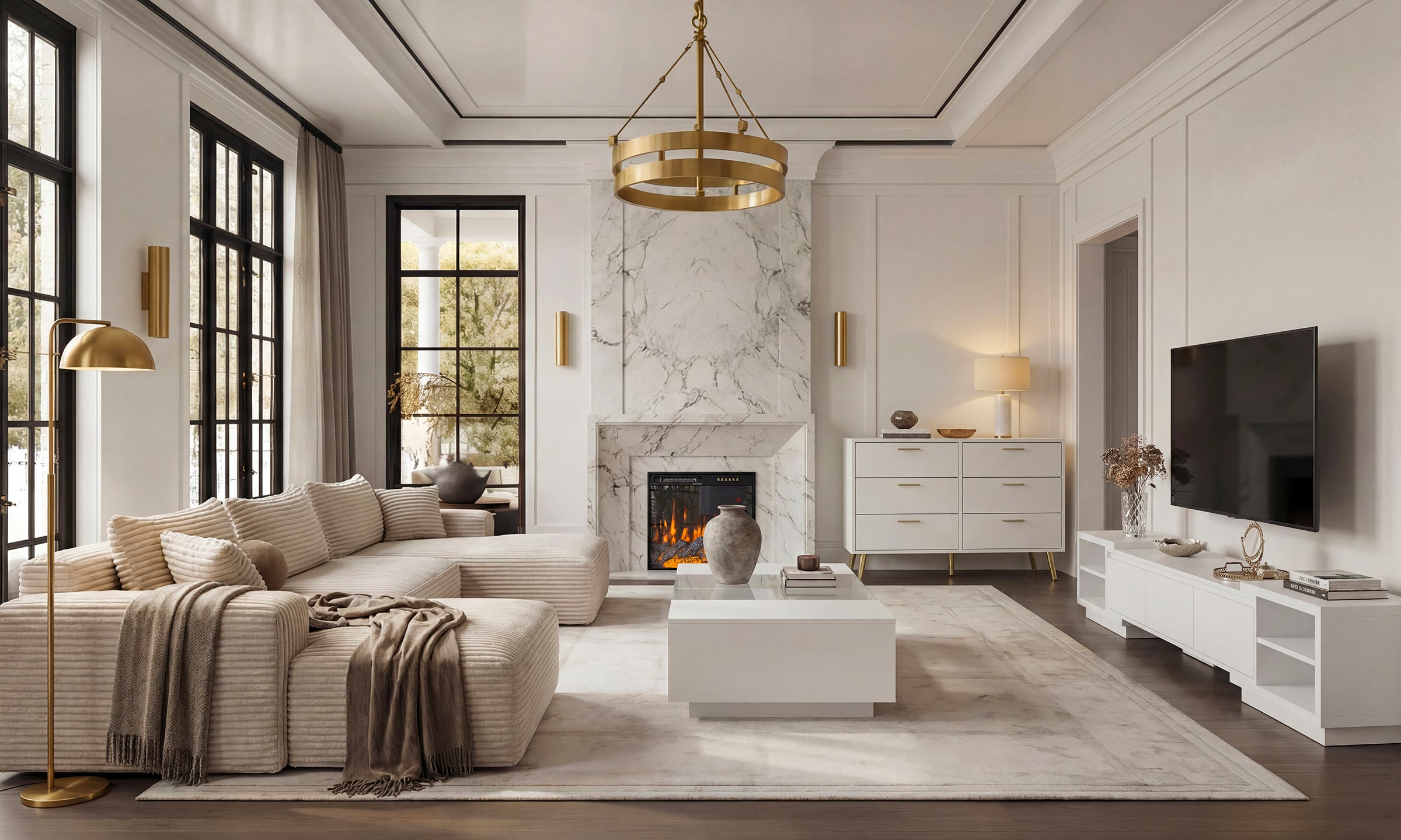
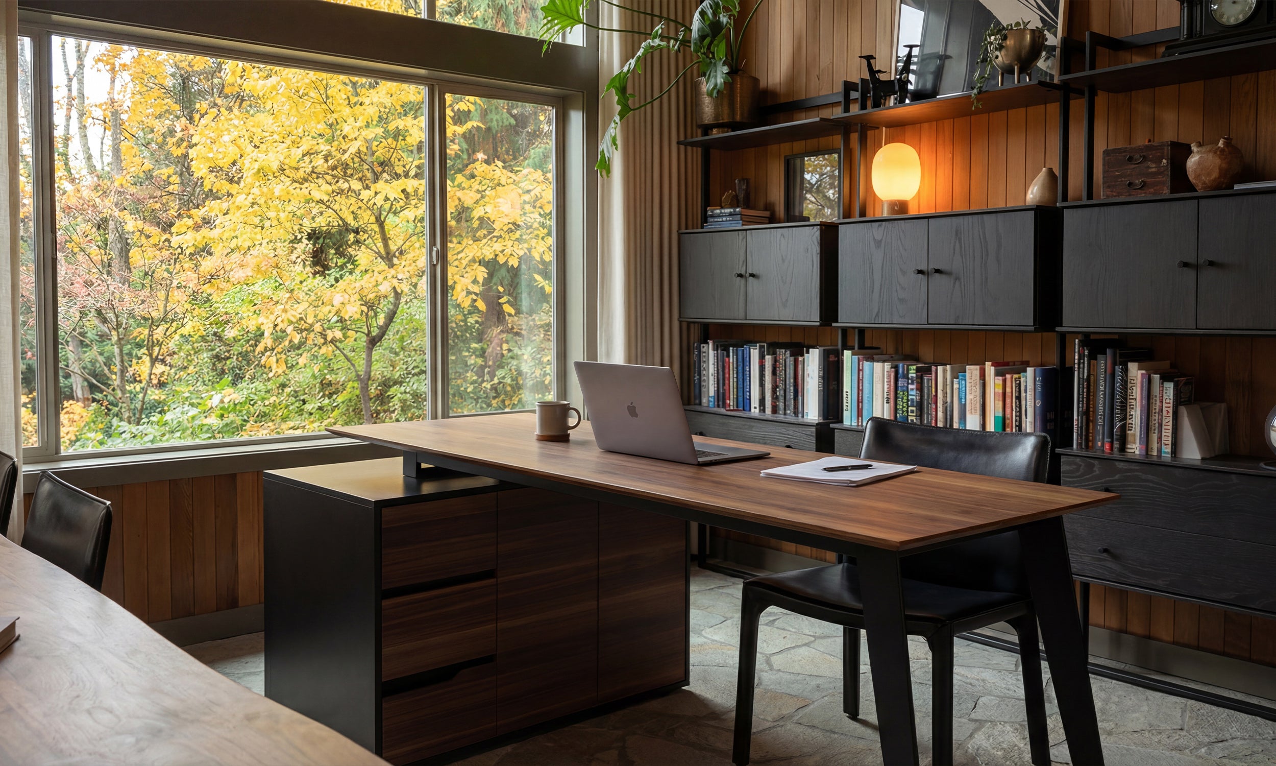
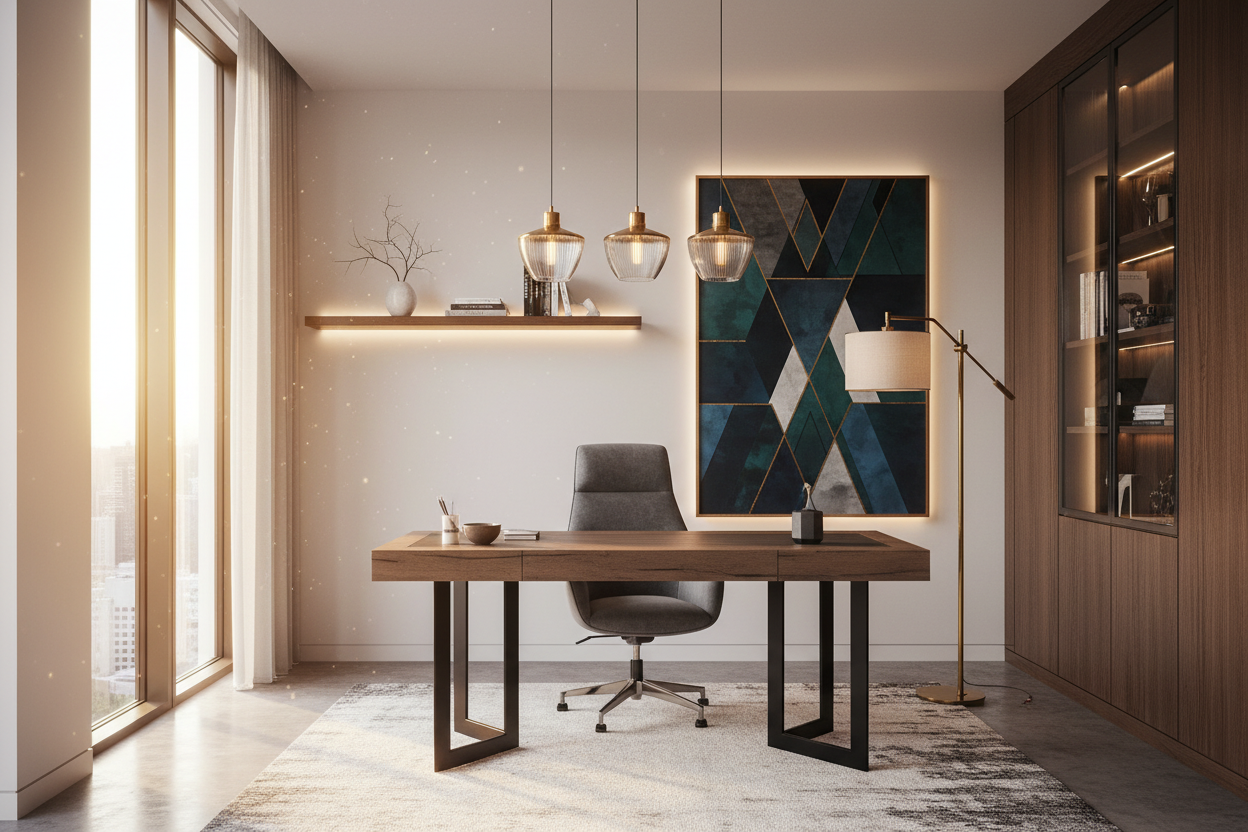
To achieve a sophisticated, designer look, you must move beyond the single overhead fixture. In interior design, we call this "layering." A luxury office space relies on three distinct layers working in harmony.
1. The Ambient Foundation
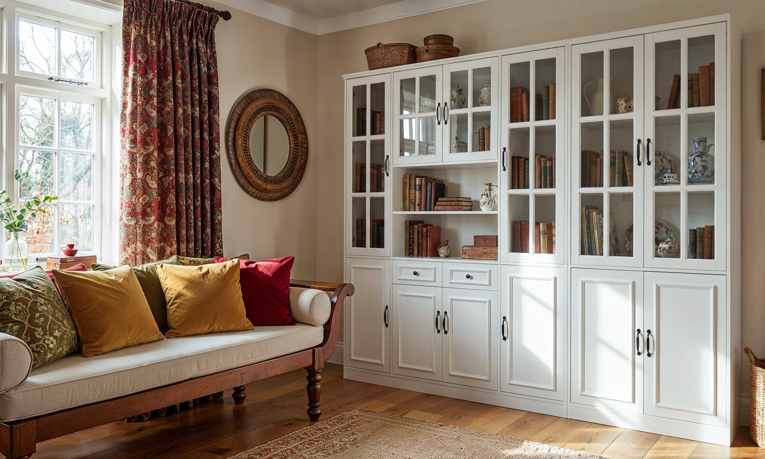
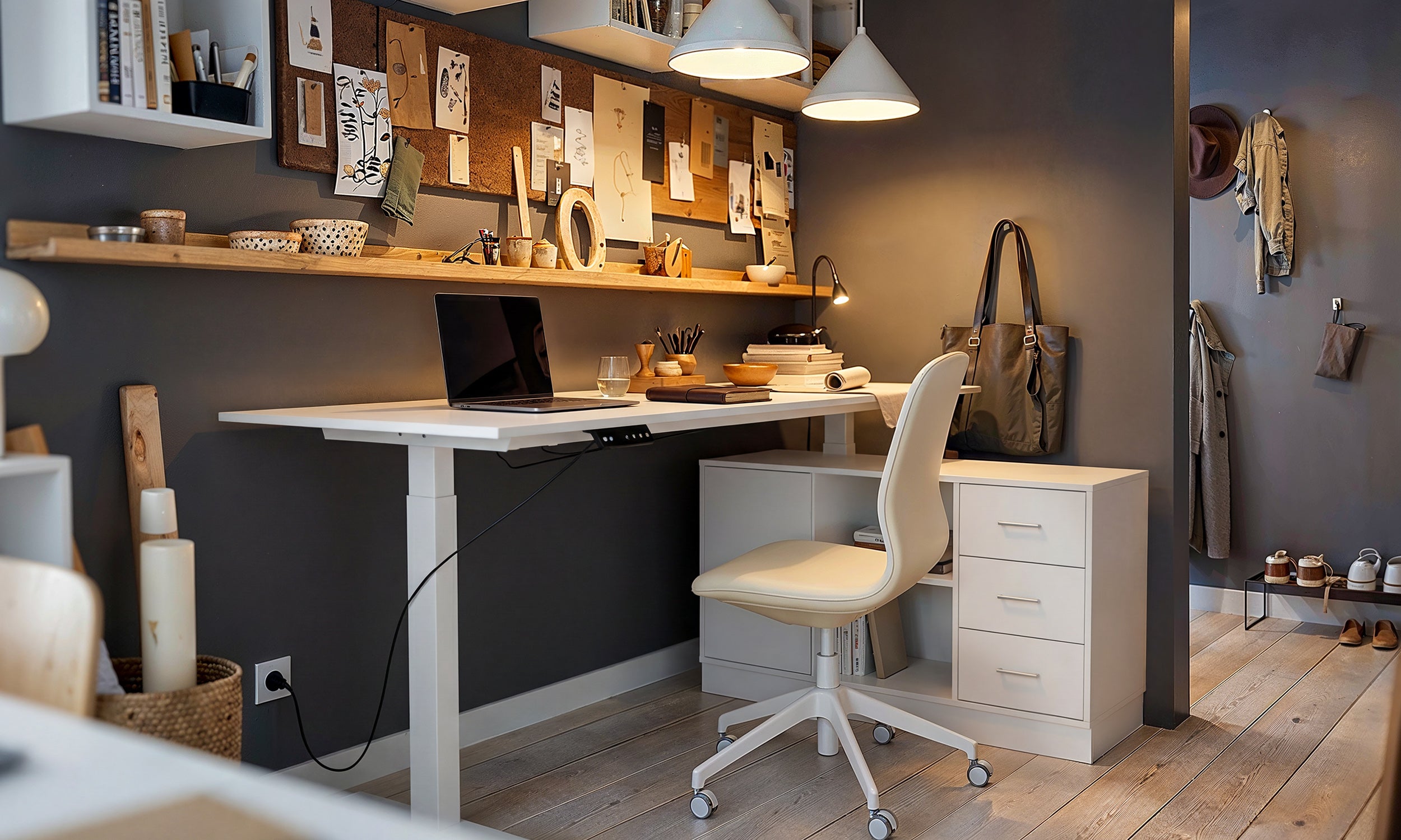
This is your general illumination. Avoid standard builder-grade flush mounts. Instead, consider a semi-flush fixture with a drum shade or a linear chandelier if you have high ceilings. The goal here is soft, uniform light that banishes dark corners without creating harsh shadows on your desk.
2. The Decorative Task Layer
This is where your office decoration lights truly shine as design elements. A desk lamp is non-negotiable, but it shouldn't look like a piece of industrial machinery (unless that is your specific aesthetic). Look for banker-style updates with marble bases or architectural lamps with asymmetrical silhouettes. The light source should be below eye level to protect your retina from direct exposure.
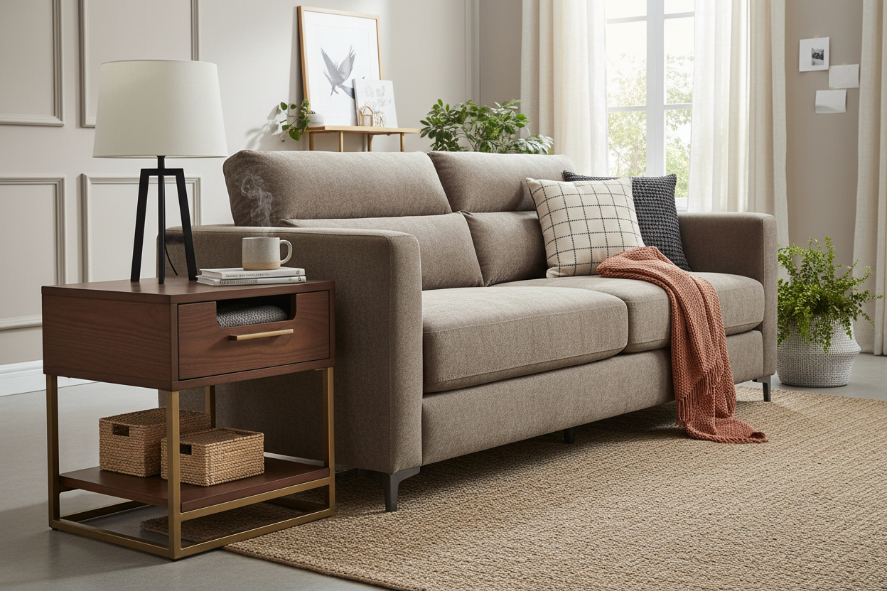
3. Accent Illumination
Accent lighting creates depth. If you have built-in shelving or a credenza, use picture lights or small, portable table lamps. This adds a warm glow to the perimeter of the room, reducing the contrast between your bright computer screen and the surrounding walls, which is a primary cause of eye strain.
Material Selection and Visual Weight
The finish of your lighting hardware dictates the room's personality. Currently, we are seeing a shift away from matching sets. Mixing metals—such as pairing a matte black floor lamp with an unlacquered brass desk lamp—adds a curated, "collected over time" feel.
However, be mindful of visual weight. If your desk is heavy and wooden, a slender, minimalist metal lamp provides necessary contrast. Conversely, a glass or acrylic desk benefits from a lamp with a substantial ceramic or stone base to ground the composition.
My Personal Take on Office Decoration Lights
I learned a hard lesson about "decorative" vs. "functional" lighting on a project in Tribeca a few years ago. I fell in love with these stunning, vintage-inspired pendant lights with clear glass globes and exposed Edison bulbs. They looked incredible in the mood board and photographed beautifully.
However, two weeks after installation, the client called me. The exposed filaments were creating severe afterimages every time she looked up from her laptop. It was literally painful to work under them. We had to swap them out for fixtures with milk-glass shades. Another detail people rarely mention: beware of textured fabric shades on desk lamps if you eat at your desk. I once specified a raw silk shade that absorbed a coffee splash instantly—it was impossible to clean. Now, I always check if the shade material is wipeable or if the switch feels substantial. There is nothing worse than a beautiful lamp with a cheap, plastic inline switch that clicks loudly during a quiet phone call.
Conclusion
Lighting is the jewelry of the home office, but it must also be the workhorse. By carefully selecting office decoration lights that offer diffusion, proper color temperature, and architectural interest, you create a space that invites creativity rather than fatigue. Don't settle for the utility aisle; curate your light sources to reflect the quality of work you intend to produce.
Frequently Asked Questions
What is the best light color for a home office?
For productivity, a color temperature between 3000K (warm white) and 4000K (cool white) is ideal. This range mimics natural daylight enough to keep you alert without the harsh, blue-tinted sterility of commercial 6000K lighting.
How do I stop my decorative lights from glaring on my monitor?
Positioning is key. Never place a light source directly behind you (reflects on the screen) or directly in front of you (shines in your eyes). Place task lighting to the side of your monitor and use shades or diffusers to soften the beam.
Can I mix different metal finishes in my office lighting?
Absolutely. In fact, mixing metals prevents the "showroom" look. A good rule of thumb is to choose one dominant metal (e.g., oil-rubbed bronze) for roughly 70% of fixtures and an accent metal (e.g., aged brass) for the remaining 30%.

Leave a comment
This site is protected by hCaptcha and the hCaptcha Privacy Policy and Terms of Service apply.