
I’ve spent way too many nights staring at my living room wall, feeling like something was fundamentally broken. I had the 75-inch 4K screen, the high-end soundbar, and a beautiful wood console, but the entertainment unit shelves looked like a chaotic garage sale. It turns out, I was committing the cardinal sin of interior design: the 'knick-knack attack.'
Most of us treat our media walls like a catch-all for every small souvenir or greeting card we’ve ever received. But here’s the cold truth: small items look like clutter when they’re sitting next to a massive piece of technology. If you want your living room to feel like a designed space rather than a storage unit, we need to talk about scale, visual weight, and why your tiny ceramic owl has to go.
Quick Takeaways
- Ditch anything smaller than a grapefruit; tiny items create visual 'noise.'
- Use the 3-item rule: one vertical, one horizontal, and one organic object per grouping.
- Leave at least 30% of your shelf space empty to let the eye rest.
- Balance the massive 'black hole' of the TV with heavy, dark-colored decor on the opposite side.
- Hide the tech—routers and tangled cords belong in closed cabinets, not on display.
The Clutter Trap of the Modern Media Wall
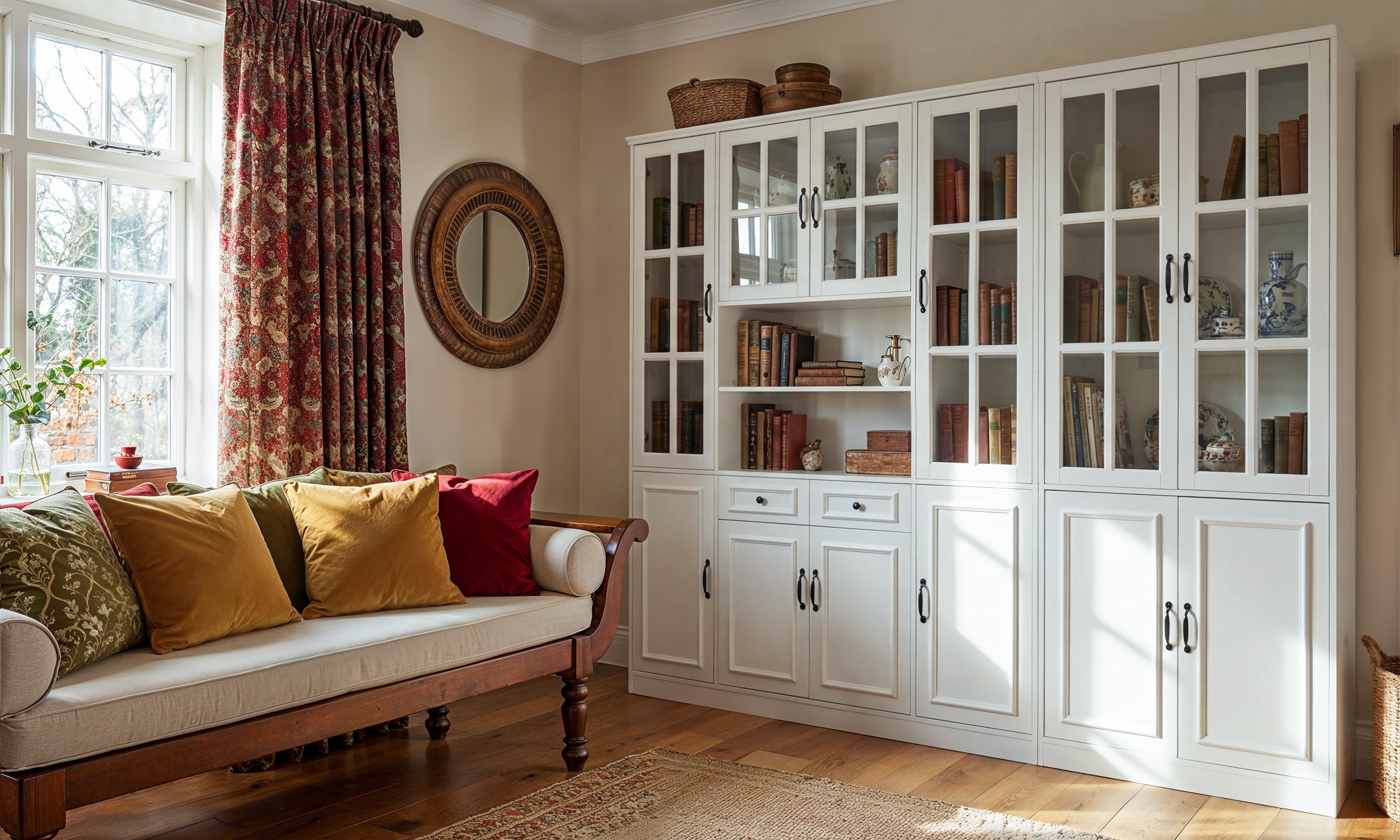
We’ve all been there. You finally pull the trigger on a modern entertainment center, spend three hours swearing at an Allen wrench, and get it perfectly leveled against the wall. Then comes the 'fun' part: filling the shelves for entertainment centers. This is usually where things go south. Without a plan, these shelves become a magnet for the random debris of life—spare HDMI cables, stacks of paperbacks you’ll never re-read, and those tiny succulents that are 90% dead.
The problem is that the TV is a giant, demanding focal point. When you surround it with dozens of small, unrelated objects, your brain can't figure out where to look. It creates a sense of low-level anxiety. I’ve seen stunning $2,000 consoles look like cheap thrift store finds because the owner decided to display their entire collection of shot glasses on the open shelving. You have to be ruthless. If an item doesn't have enough 'heft' to be seen from the sofa, it doesn't belong on your media wall.
Why Scale is Everything (And Tiny Decor Fails)
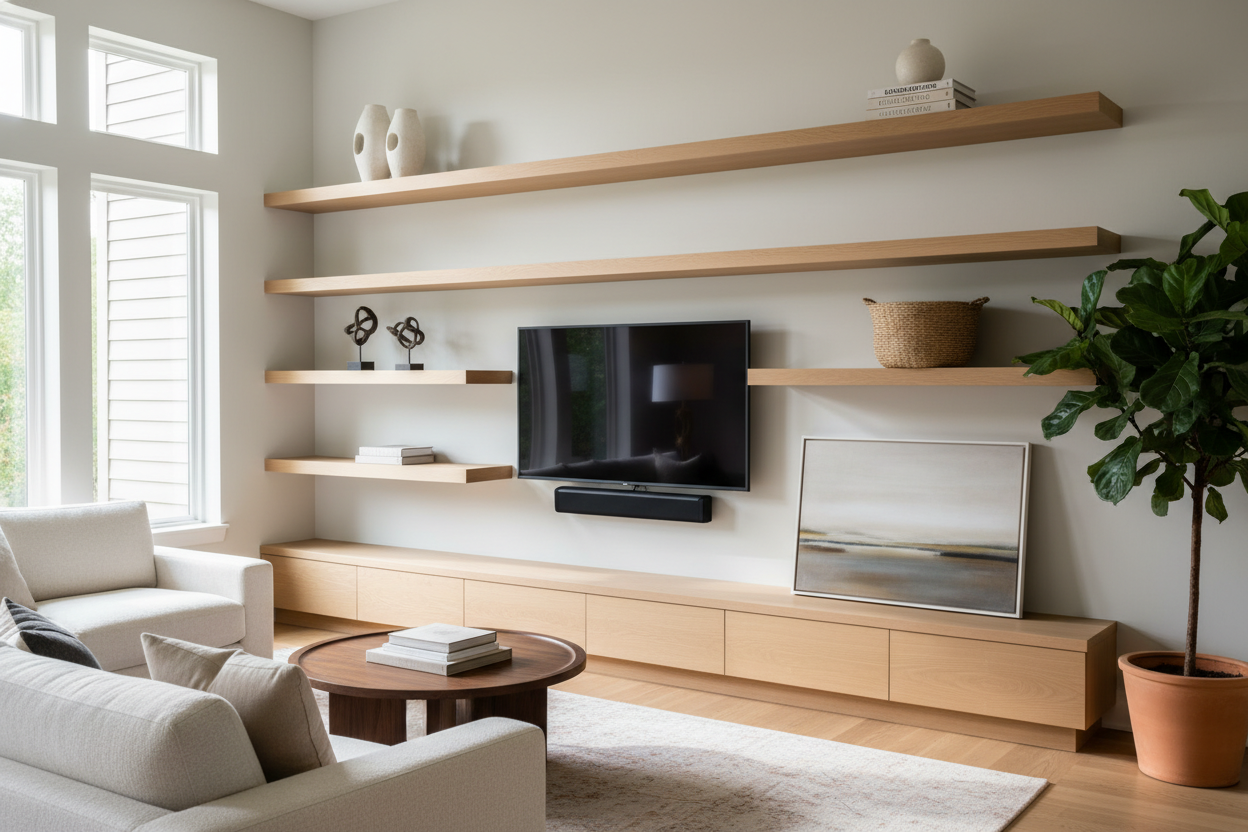
Scale is the one thing most DIY decorators get wrong. A 65-inch TV is a massive black rectangle that commands the room. To balance that out, entertainment center shelves need objects that can hold their own. If you put a tiny 4-inch photo frame on a shelf next to a giant screen, the frame effectively disappears, leaving the shelf looking 'toothy' and unfinished.
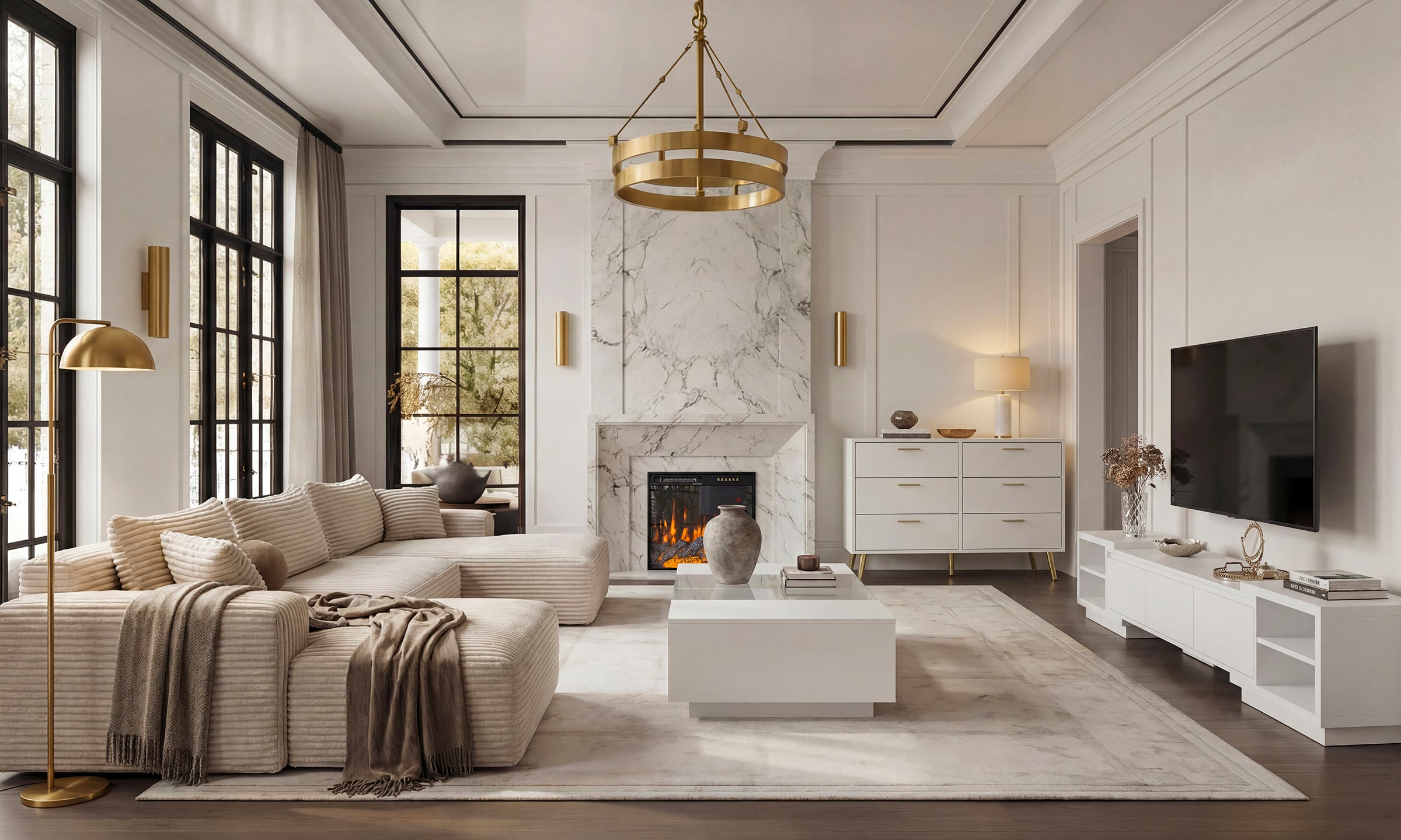
Think in terms of 'visual weight.' You want items that feel heavy and substantial. I’m talking about oversized ceramic vases, thick coffee table books stacked four high, or a piece of sculptural driftwood. If you have a collection of smaller items you absolutely love, group them together on a tray or inside a glass cloche. This turns five small 'distractions' into one large 'statement.' I personally transitioned to using 12-inch tall stoneware jars on my unit, and the difference was immediate. The room felt anchored and intentional, rather than scattered.
The 3-Item Formula for Foolproof Styling
Styling a shelf entertainment center doesn't require an art degree; it just requires a formula. My go-to is the 'Vertical, Horizontal, Organic' trio. For each shelf or section, I try to include one tall item (like a candlestick or tall vase), one flat stack (like three design books), and one organic shape (like a bowl, a plant, or a piece of coral). This variety in height and texture prevents the shelves from looking like a retail display at a big-box store.
When you're styling a bookcase and entertainment center, you also want to play with symmetry—or the lack of it. Don't mirror both sides of the TV exactly. If you have a tall plant on the left, put a chunky stack of books and a bowl on the right. This 'asymmetrical balance' keeps the eye moving and makes the setup feel curated over time rather than bought as a set. I always tell people to step back 10 feet after placing an item. If you can't clearly identify what the object is from that distance, it’s too small.
Embracing Negative Space
The biggest mistake I see? Feeling the need to fill every square inch of the shelves for entertainment center. Negative space—the empty areas between objects—is a design element in itself. It gives the eye a place to rest. If every shelf is packed tight, the entire unit starts to feel like a wall of 'stuff' that’s closing in on you. Aim for about 30% empty space. This breathing room makes the items you do choose to display feel more important and expensive. It’s the difference between a high-end gallery and a crowded antique mall.
Mixing Open Display With 'Hideaway' Storage
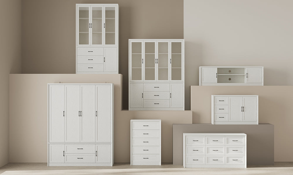
Let’s be real: a living room has to function. You have remotes, game controllers, a router that looks like a robotic spider, and a nest of cords that could choke a horse. You cannot style your way out of 'ugly tech.' This is why I always recommend a unit that combines storage cabinets and open shelves. The open shelves are for your 'pretty' things—the books, the art, the sculptural pieces. The cabinets are for the chaos.
I’ve found that using decorative baskets on open shelves is a great middle ground if you don't have built-in doors. I use heavy-weave rattan baskets to hide my PlayStation controllers and charging cables. It adds a nice texture to the shelves while keeping the visual clutter at zero. Remember, the goal is to create a space that looks like a magazine but functions like a home. If you have to move a delicate porcelain bird every time you want to find the remote, your styling has failed the 'real life' test.
My Personal Take
I once tried to style an 84-inch media console using my entire collection of vintage Star Wars figures. I thought it was a 'personality' move. In reality, it looked like a toy aisle exploded next to my TV. It was distracting during movies and a nightmare to dust. I eventually gave the figures their own dedicated (and enclosed) shelf in the office and replaced them with three massive matte-black vases and a few leather-bound books. The room instantly felt more 'grown-up' and, ironically, the TV looked better because it wasn't competing with 50 tiny stormtroopers for my attention. Don't be afraid to edit. If you're unsure about an item, take it away for 24 hours. If you don't miss it, it stays off the shelf.
FAQ
How do I hide cords on open entertainment center shelves?
Use cord clips that adhere to the back of the shelf legs, or 'snake' the cords behind a stack of large books. If the unit has an open back, you can also use a matching piece of foam board to create a false back that hides the wires.
What's the best height for items on these shelves?
Vary the heights, but ensure your tallest items are at least 1/3 the height of the TV screen. This helps the shelving feel connected to the TV rather than like a separate, smaller entity.
Should I color-coordinate my books?
Only if you want a very specific, 'staged' look. For a more authentic feel, just remove the glossy paper jackets from your hardcovers. The linen textures underneath usually look much more high-end and cohesive than a rainbow of plastic-looking spines.


Leave a comment
This site is protected by hCaptcha and the hCaptcha Privacy Policy and Terms of Service apply.