
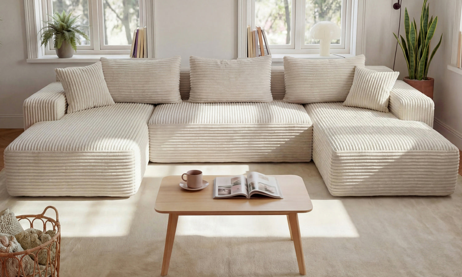
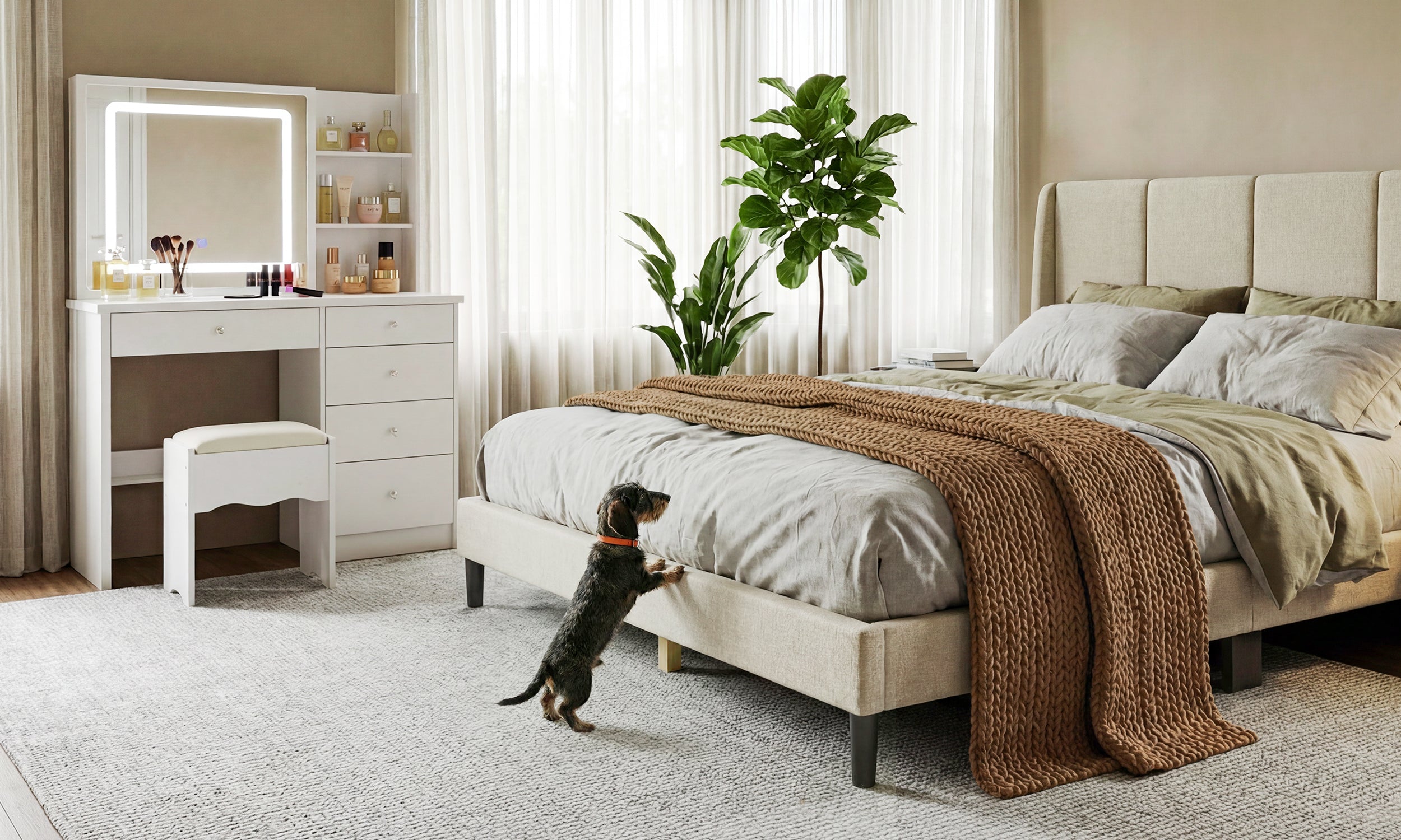
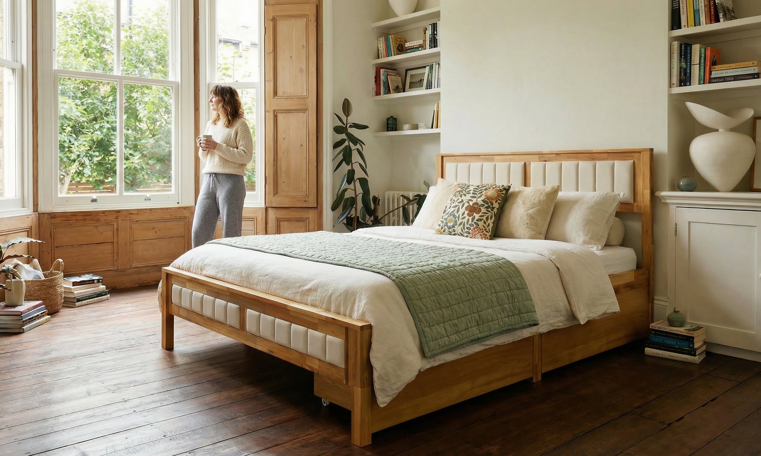
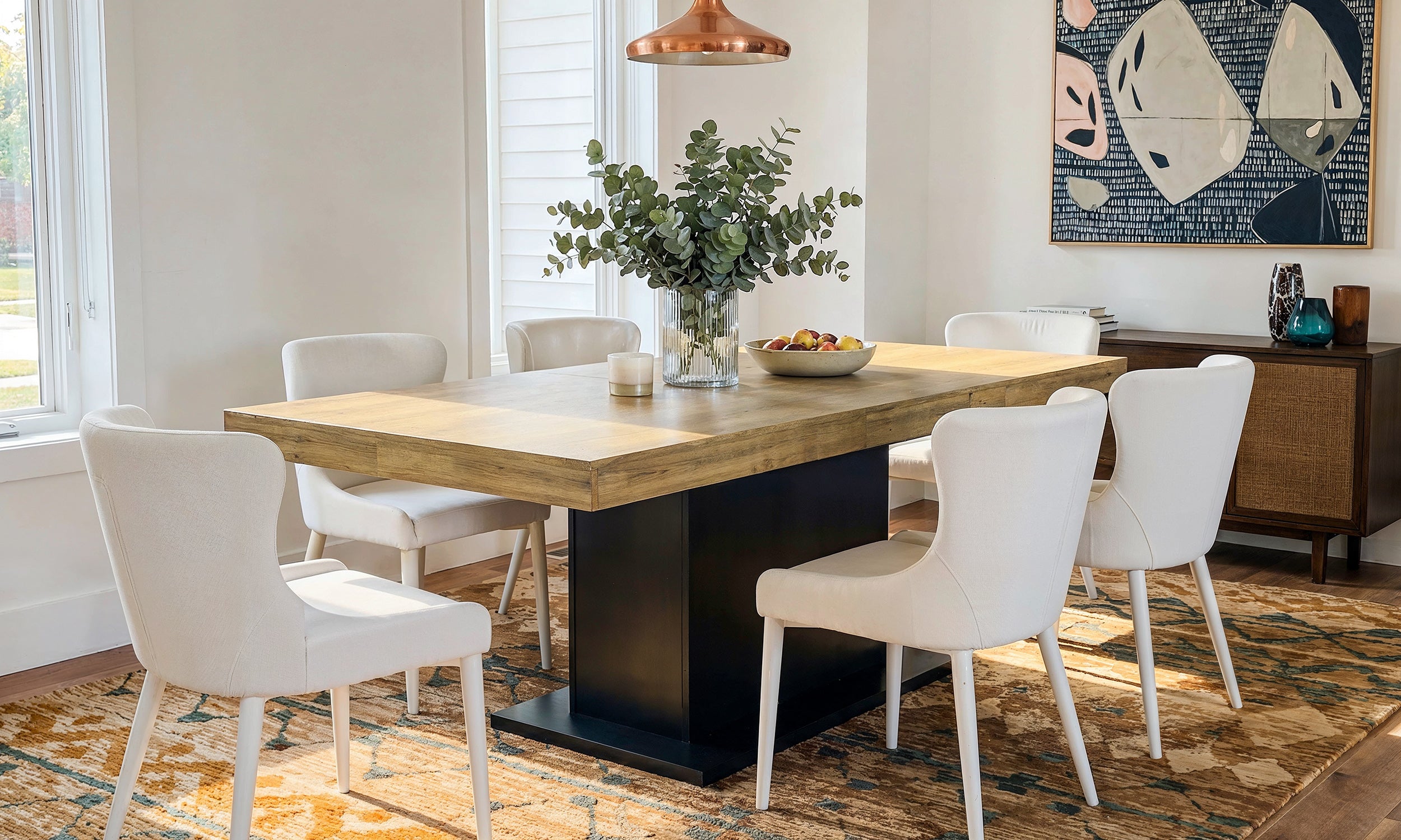
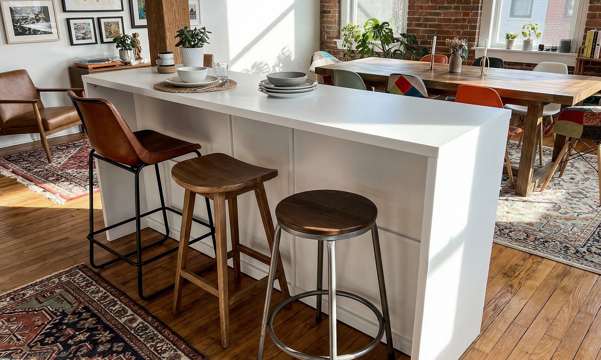



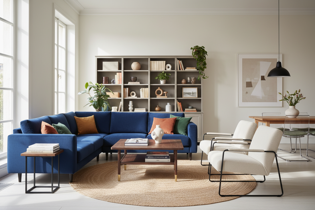
We have all been there: standing in the middle of the warehouse, surrounded by flat-packs, wondering if that beige armchair will warm up the living room or just look washed out against the rug. The challenge isn't availability; it is curation. When selected without a plan, ikea furniture colors can read as flat or overly institutional. However, when you understand undertones, finish textures, and visual weight, you can manipulate these mass-market pieces to mimic the look of bespoke joinery.
Quick Decision Guide
Before you load up your cart, consider these four critical factors to ensure your furniture integrates seamlessly into your home:
- Identify the Undertone: Not all IKEA whites are the same. Some lean cool (blue/grey base) while others are creamy (yellow base). Mixing them unintentionally creates a dirty look.
- Assess the Finish: High-gloss reflects light and expands space but shows fingerprints; matte finishes absorb light and feel more grounded but can look flat in dim rooms.
- Material Consistency: Stick to one primary wood veneer (e.g., ash or oak) per room to avoid a chaotic, mismatched aesthetic.
- Contrast Levels: Decide if you want the furniture to blend into the walls (low contrast, built-in look) or stand out as a focal point (high contrast).
Decoding the Standard Finishes
To style a room effectively, you must understand the "Big Three" in the IKEA palette: The Whites, The Black-Browns, and The Veneers.
The Complexity of White
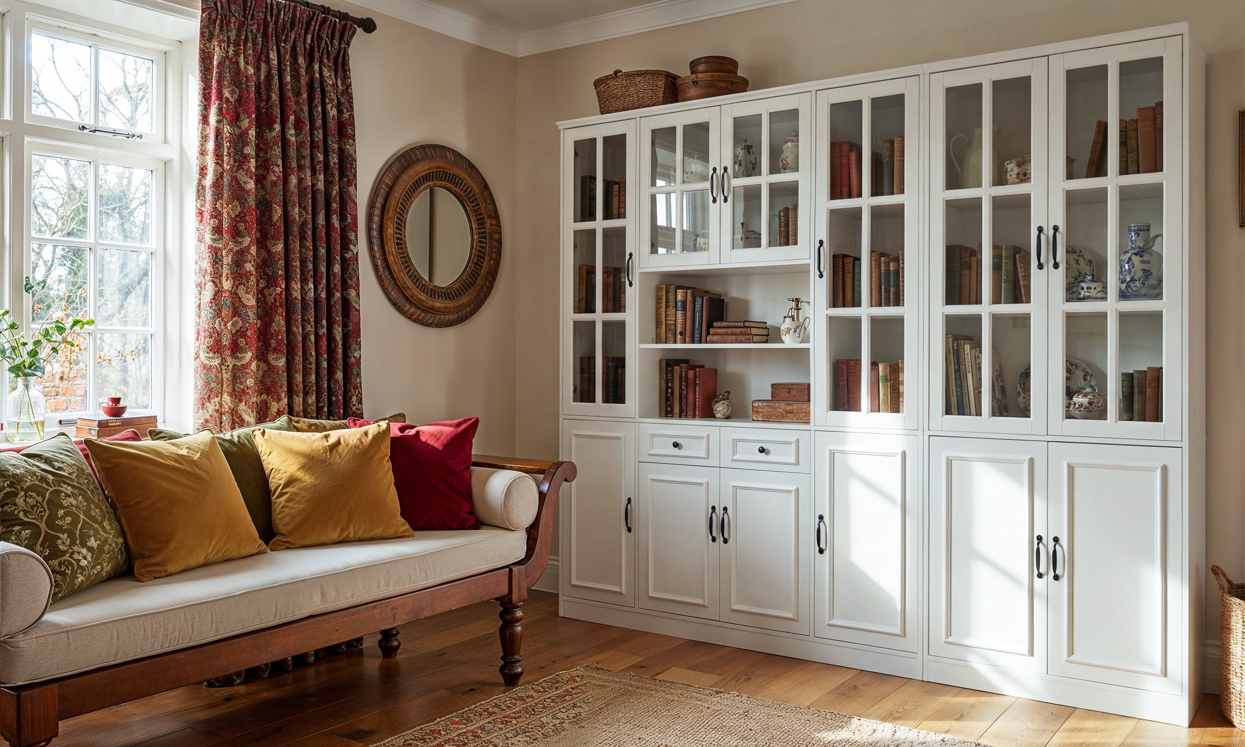
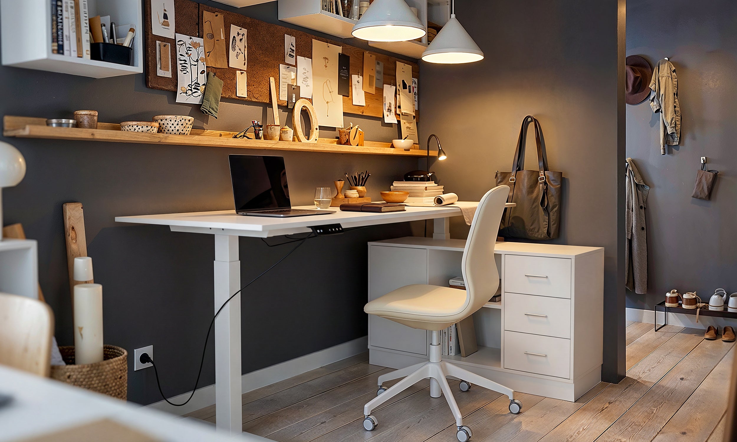
The most common mistake I see clients make is assuming "white is white." The standard white foil finish on a BILLY bookcase is often slightly warmer than the stark, cool white of a high-gloss BESTÅ unit. If you place these side-by-side, the warmer white will instantly look yellowed and aged. When planning a layout, always check the product description for the specific finish type (foil, lacquer, or stain) and try to keep them consistent within a single sightline.
The Visual Weight of Black-Brown
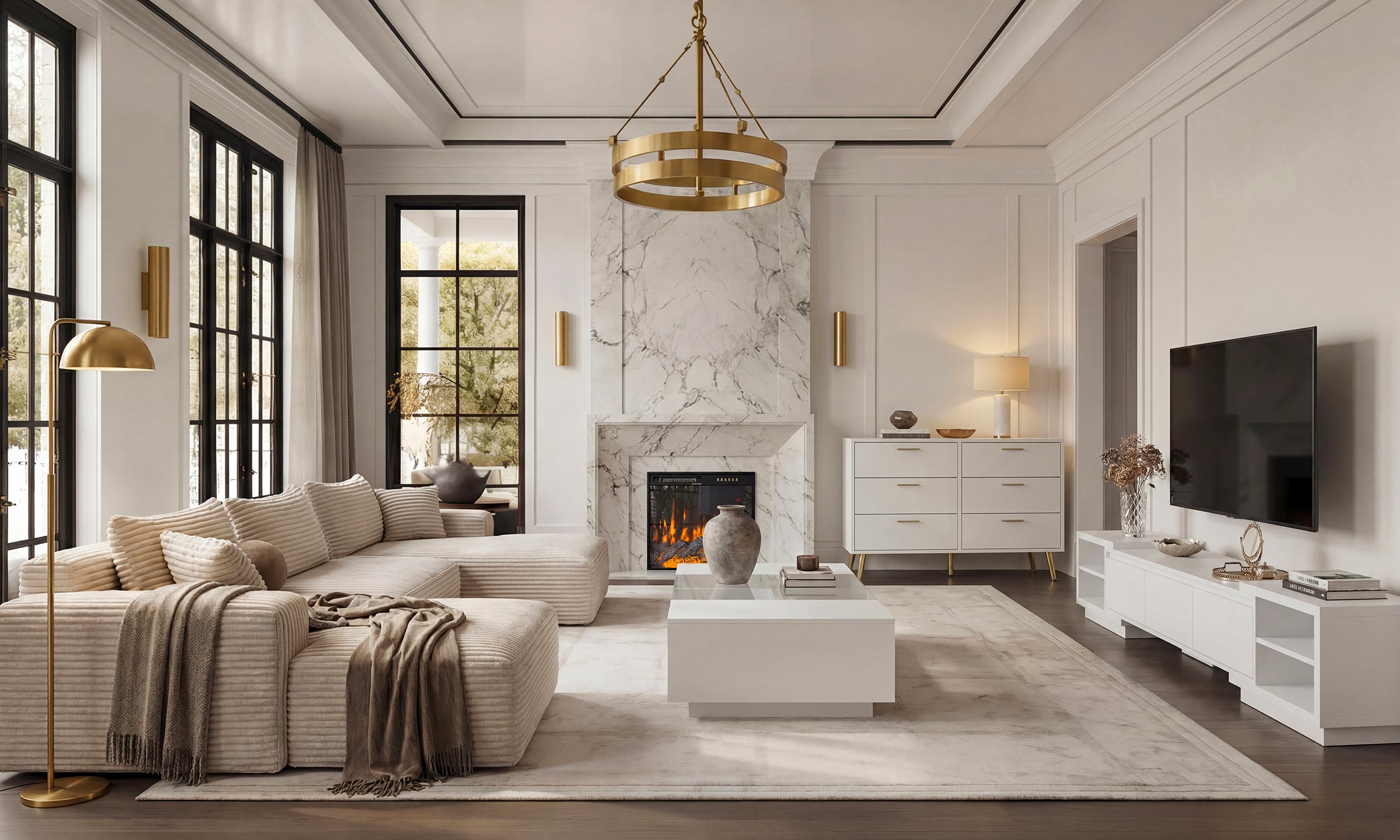
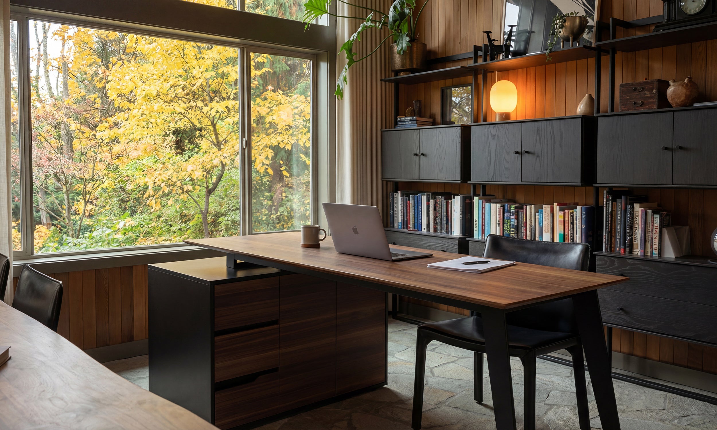
The Black-Brown finish is a staple for a reason—it grounds a space. However, it is optically very heavy. In a small room, a wall of Black-Brown PAX wardrobes can feel oppressive. To balance this, I recommend using this color for pieces that sit lower to the ground, like a coffee table or a low media console, allowing the upper vertical space to remain airy. This maintains the room's "breathability" while providing necessary contrast.
Elevating the Look: Texture and Materiality
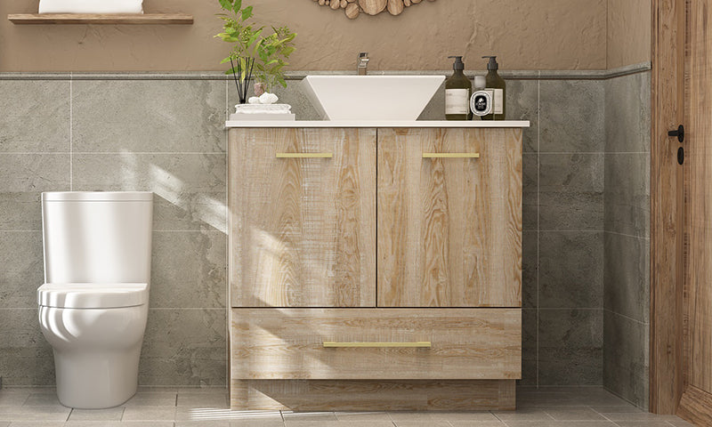
Color is not just about hue; it is about how the surface interacts with light. Flat melamine colors can look inexpensive because they lack depth. To counter this, look for the "stained" series (like HEMNES or HAVSTA). These pieces use a semi-opaque stain that allows the grain of the solid pine to show through.
This introduction of natural texture breaks up the monotony of a solid color block. It adds an organic element that feels more tactile and expensive. If you are mixing metals, standard IKEA hardware often falls flat. Swapping out standard knobs for brushed brass or matte black handles can shift the perceived color of the furniture entirely, pulling out warmer or cooler tones in the finish.
My Personal Take on ikea furniture colors
In my years of designing budget-conscious interiors, I have learned a hard lesson about the "White Stain" oak effect. A few years ago, I designed a home office for a client using the white-stained oak veneer. Initially, it looked like a beautiful, Scandi-inspired whitewashed wood.
However, within eighteen months, the UV exposure from the window caused the underlying wood tone to amber significantly. The "white wash" turned into a patchy beige that clashed with the cool grey walls we had painted. Now, when I specify these pieces, I am brutally honest with clients: if the piece is going in direct sunlight, opt for the solid painted finishes (lacquer or foil) rather than the translucent stains. The solid colors hold their integrity much longer, whereas the veneers require a UV-protected environment to maintain that initial showroom hue.
Conclusion
Achieving a luxury look with mass-market furniture is entirely possible if you stop treating the pieces as defaults and start treating them as design elements. By paying attention to the subtle temperature of whites, the heavy anchoring of dark tones, and the texture of veneers, you can curate a space that feels intentional and sophisticated. Don't just fill a space; design it.
Frequently Asked Questions
Can I paint over laminate IKEA furniture to change the color?
Yes, but preparation is key. You cannot paint directly over the laminate or foil. You must use a high-adhesion shellac-based primer (like BIN) first. Without this specific primer, your new color will scratch off with a fingernail within days.
How do I mix IKEA wood tones with vintage wood furniture?
The secret is matching the undertone, not the darkness. If your vintage table has warm, orange-red undertones (like cherry or mahogany), avoid the grey-toned "ash" IKEA finishes. Instead, look for walnut veneers or solid black to create a deliberate contrast rather than a near-miss match.
Why do my IKEA white cabinets look different shades?
IKEA uses different manufacturers and materials (melamine, foil, lacquer) across different product lines. A KALLAX white is not the exact same RAL color as a VOXTORP kitchen front. It is best to avoid abutting two different product lines directly against each other.

Leave a comment
This site is protected by hCaptcha and the hCaptcha Privacy Policy and Terms of Service apply.