
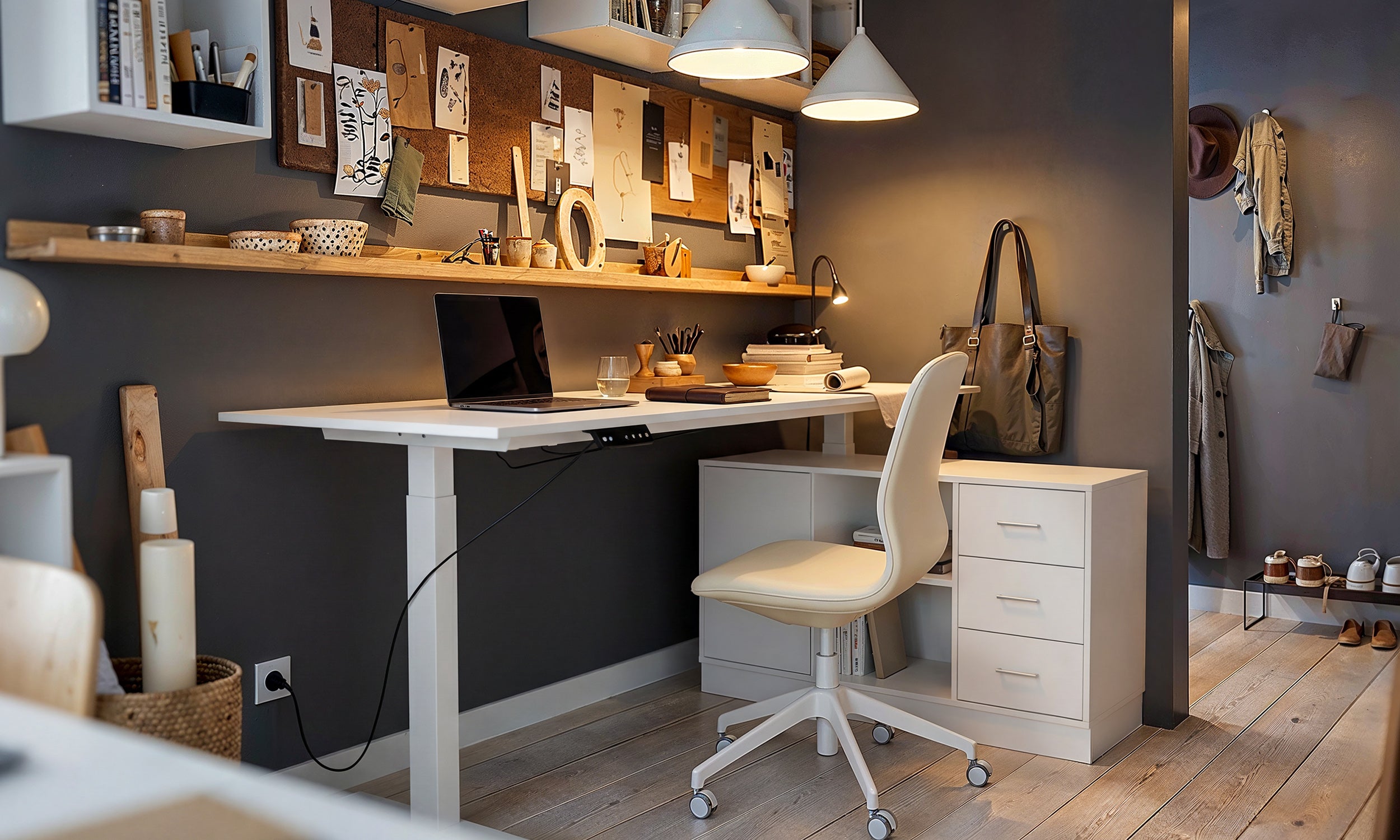
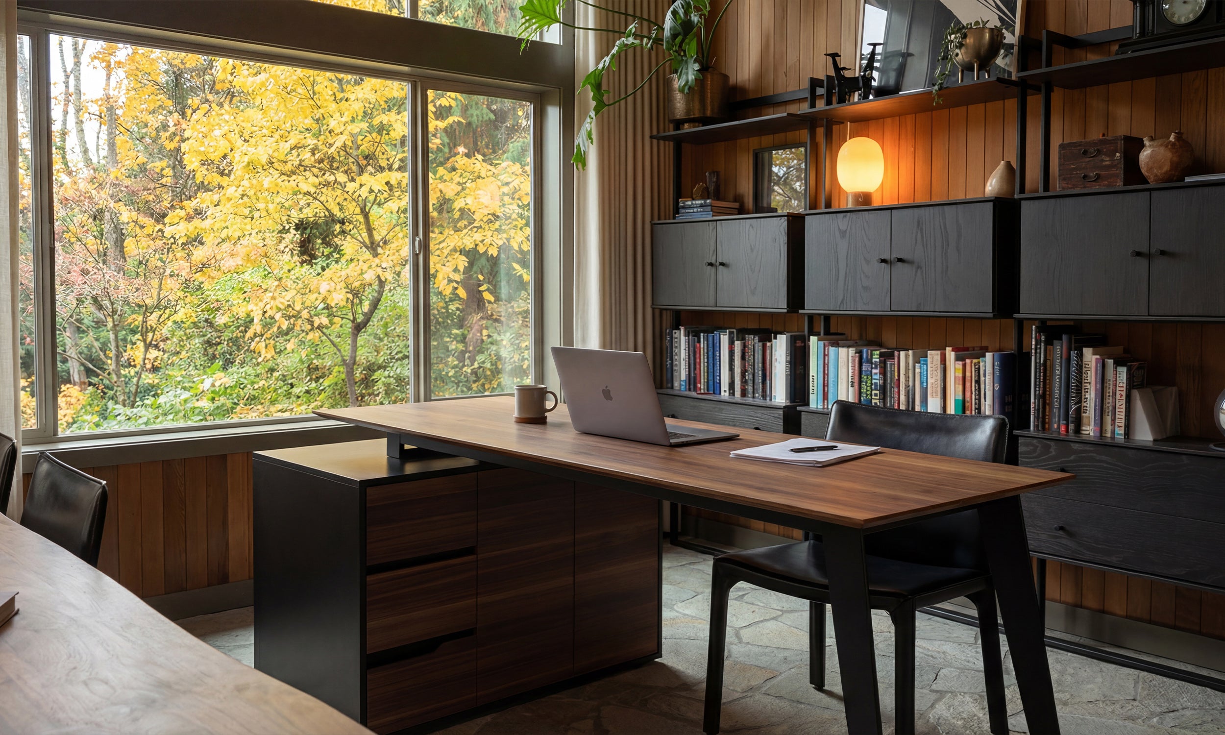

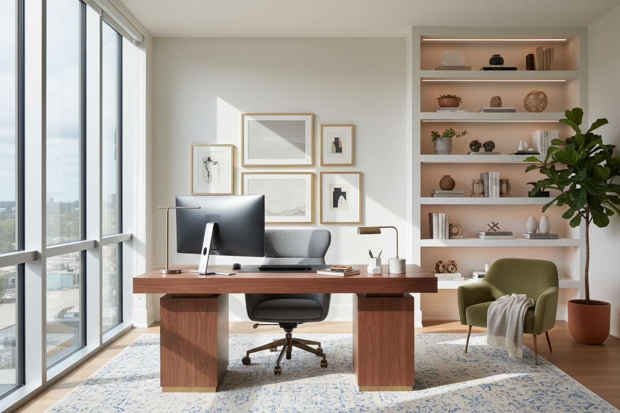
We have all experienced the fatigue of staring at a sterile, uninspiring workspace. Whether you are in a corporate high-rise or a converted spare bedroom, the environment you inhabit directly dictates your cognitive endurance. The dilemma often lies in distinguishing between clutter and curation. Finding the right office decoration inspo isn't just about pinning images of expensive furniture; it is about understanding how texture, lighting, and spatial planning converge to create a space that feels both professional and personal. This guide will walk you through the design principles I use to elevate workspaces from functional to exceptional.
Key Elements of a Designer-Approved Office
Before buying a single accessory, consider these fundamental pillars of office design. Focusing on these ensures your space remains timeless rather than trendy.
- Visual Weight & Balance: Distribute heavy furniture (like solid wood desks) with lighter elements (glass shelving or slender lamps) to avoid a cramped feel.
- Lighting Layers: Never rely solely on overhead lighting. Integrate task lighting (desk lamps) and ambient lighting (floor lamps) to reduce eye strain.
- Tactile Variety: Mix materials—leather, wood, metal, and textiles—to create depth and warmth.
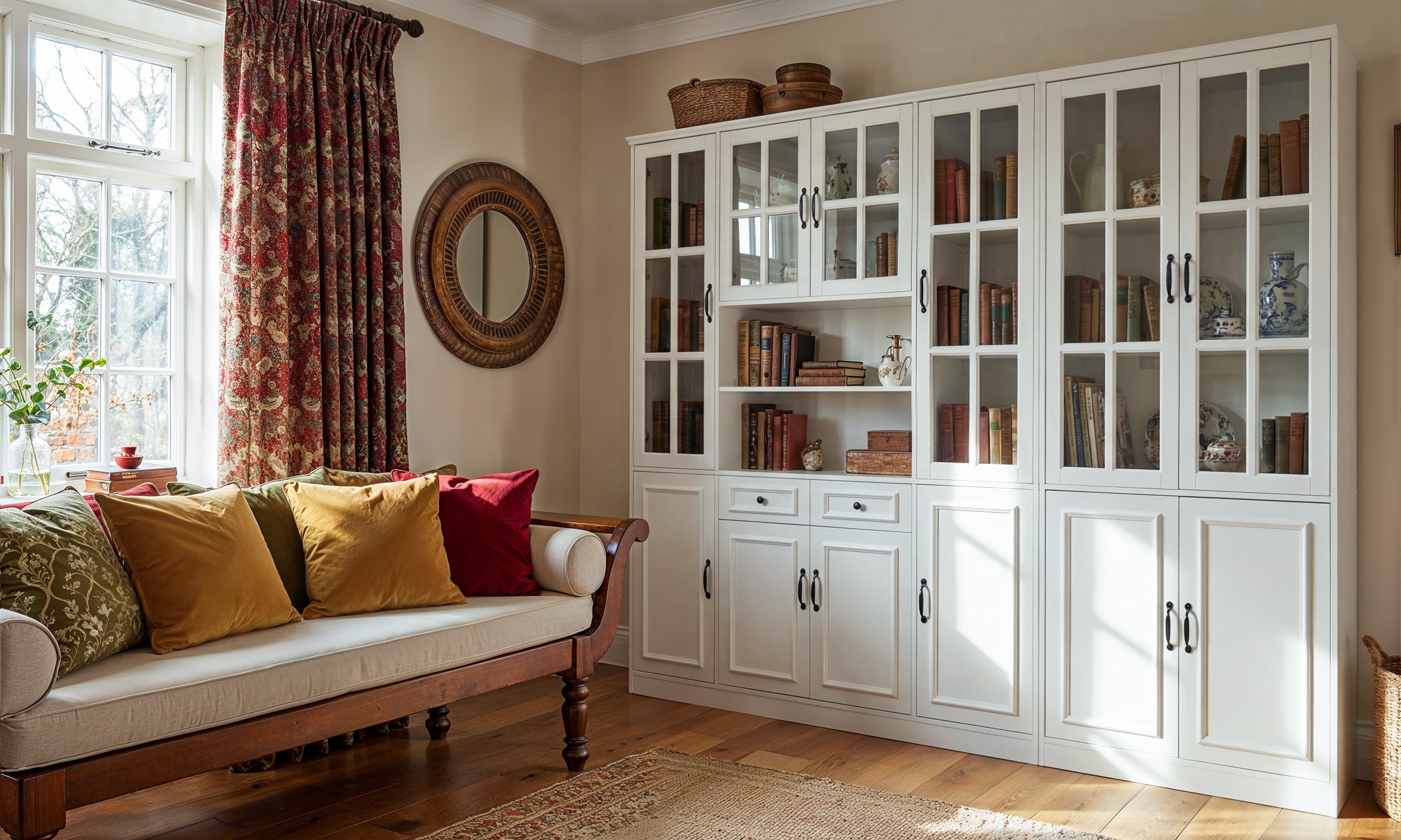
- Vertical Utilization: Use wall space for storage and art to keep the horizontal work surface clear for actual work.
Defining the Aesthetic: Beyond the Desk
When clients ask for office decor inspo, they often focus strictly on the desk accessories. However, as a designer, I look at the envelope of the room first. The goal is to create a cohesive narrative.
Mastering Vertical Real Estate
Your walls are the largest canvas in the room. For genuine office wall inspo, move away from generic motivational posters. Instead, consider acoustic felt panels which offer a dual benefit: they dampen sound (crucial for video calls) and add geometric texture. Alternatively, a floating shelf system styled with a mix of trailing plants and hardcover books introduces organic shapes that break up the rigid lines of monitors and keyboards.
The Nuance of Material Selection
The difference between a space that feels "cheap" and one that feels "luxury" is almost always material quality. When selecting furniture or decor, look for authenticity. A solid walnut tray for your stationery ages beautifully, developing a patina over time, whereas a plastic organizer will simply scratch and dull. If you are looking for office inspo decor that lasts, prioritize natural materials like stone, leather, and wood over synthetic veneers.
Ergonomics Meets Style
A common pitfall is sacrificing comfort for an aesthetic seen on social media. An acrylic chair might look ghost-like and chic, but it offers zero lumbar support. Design is problem-solving, not just decoration. Look for chairs with high-performance fabrics—like commercial-grade wool blends—that offer breathability and durability. Style your ergonomic setup with a throw blanket in a complementary texture, like chunky knit or cashmere, to soften the technical look of the machinery.
Lessons from My Own Projects
I want to share a specific realization from a project I completed last year that changed how I view office finishes. I was designing a home office for a tech executive who wanted a sleek, ultra-modern look. We selected a stunning, high-gloss black lacquer desk. It looked incredible in the showroom and in photos.
However, two weeks after installation, I got a call. The issue wasn't the look; it was the usability. The high-gloss finish acted like a mirror, reflecting the glare from his dual monitors directly into his eyes, causing migraines. Furthermore, every single fingerprint showed up, requiring constant polishing. We ended up swapping it for a matte, honed ebonized oak. The lesson? Always test your surfaces against your lighting and usage habits. Matte or satin finishes are almost always more forgiving and practical for a working surface than high-gloss, no matter how good the glossy photo looks on Pinterest.
Conclusion
Creating a workspace that inspires productivity requires a delicate balance of form and function. By focusing on quality materials, proper lighting layers, and ergonomic realities, you can curate a space that transcends fleeting trends. Remember that the best office decoration is that which serves your workflow while delighting your eye. Start with the basics, invest in touch-points, and build a room that commands respect.
Frequently Asked Questions
How do I decorate a small office without making it feel cluttered?
In small spaces, rely on closed storage to hide paperwork and tech clutter. Keep visible decor minimal and large-scale—one large piece of art or a single statement lamp makes a room feel bigger than twenty small trinkets.
What is the best color temperature for office lighting?
Aim for a color temperature between 3500K and 4000K. This "cool white" range mimics natural daylight and promotes alertness and focus, whereas warmer tones (2700K) can induce drowsiness.
Is wallpaper professional enough for a home office?
Absolutely. A subtle, textured wallpaper (like a grasscloth or linen effect) adds incredible sophistication and sound absorption. Avoid overly busy patterns on the wall behind your monitor to prevent visual fatigue.

Leave a comment
This site is protected by hCaptcha and the hCaptcha Privacy Policy and Terms of Service apply.