
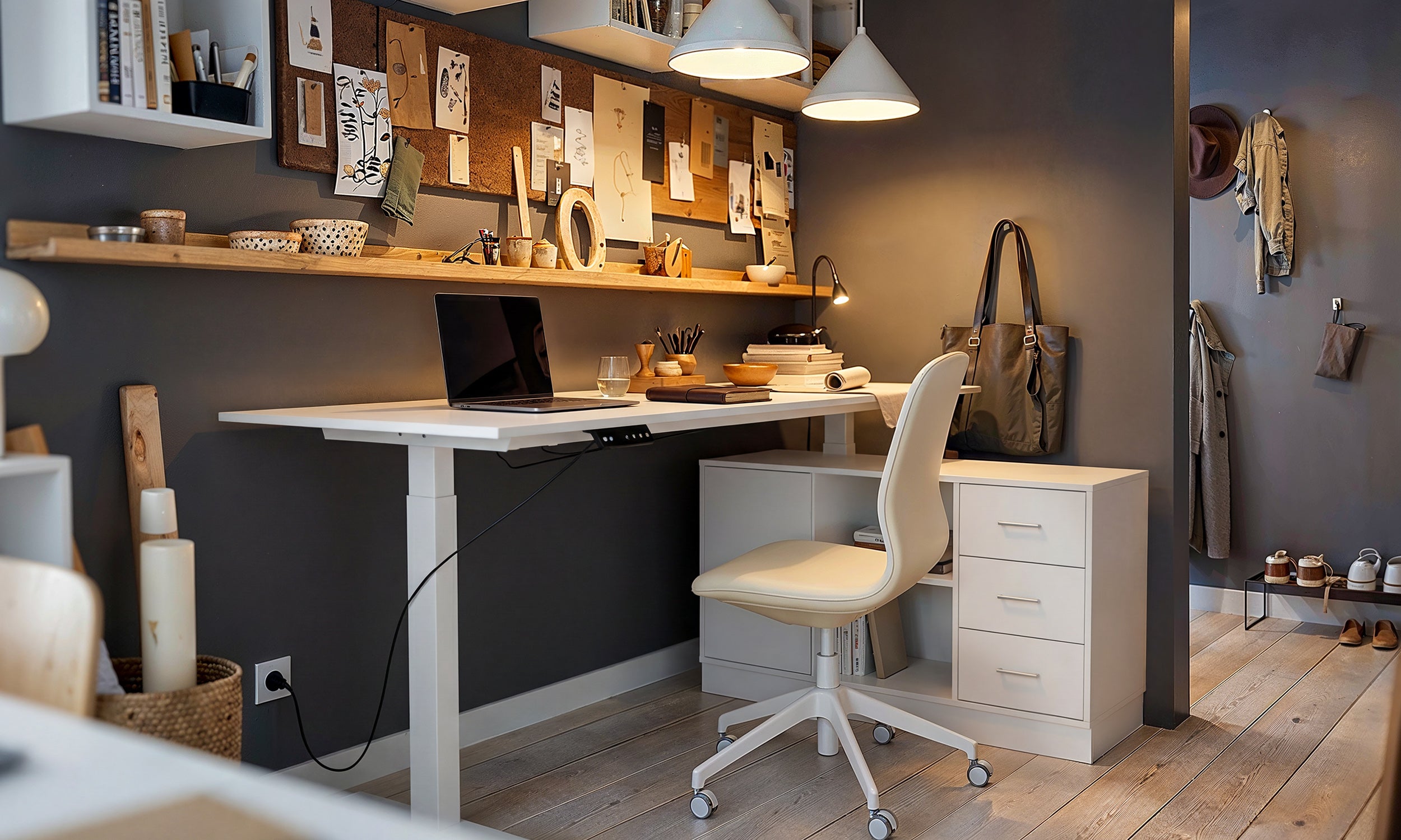
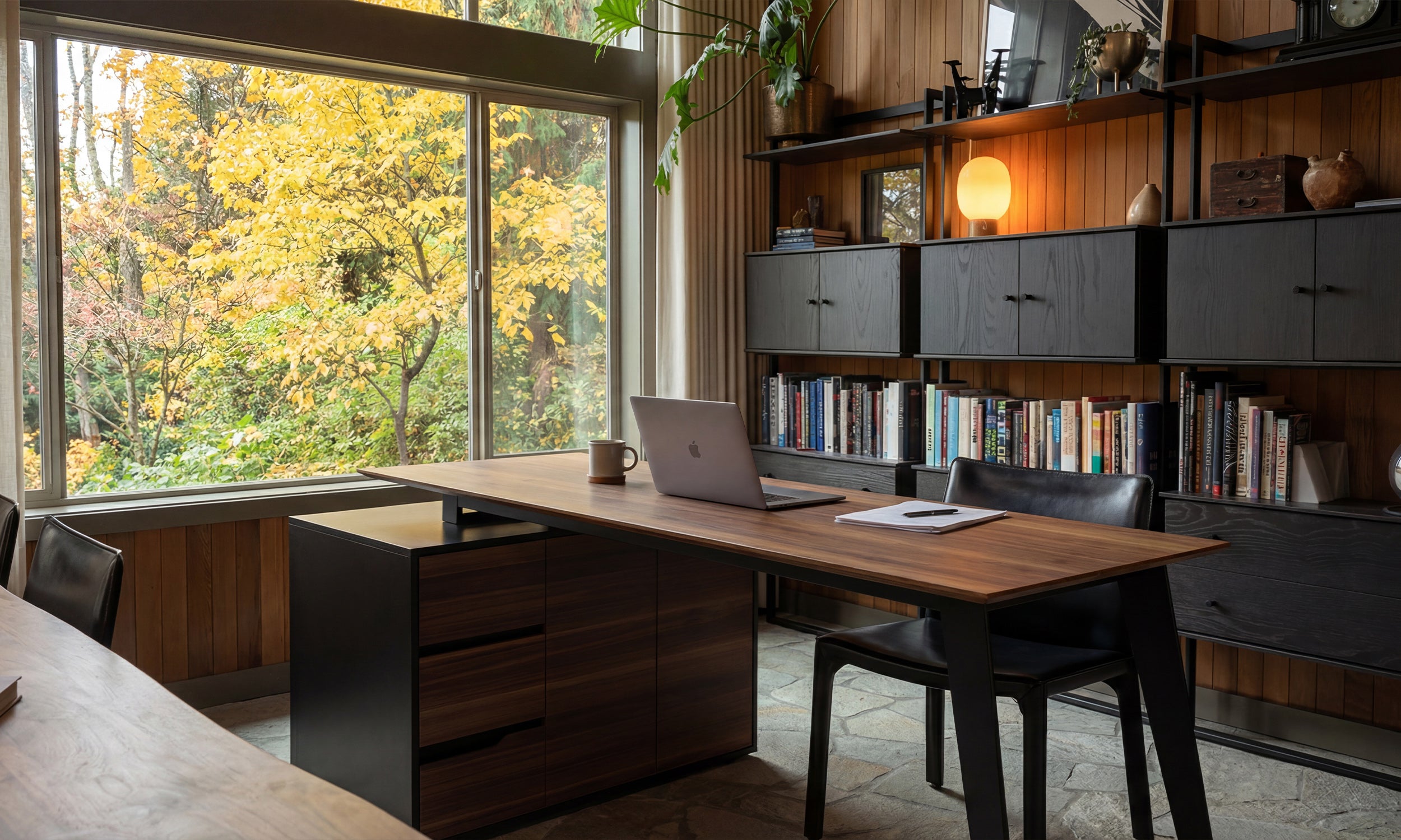


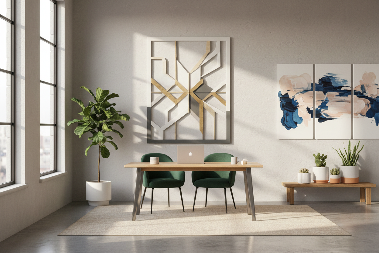
There is nothing quite as uninspiring as a blank, sterile wall staring back at you while you try to meet a deadline. In my years designing corporate headquarters and home offices, I have found that the environment dictates the workflow. While investing in an ergonomic chair is non-negotiable, the visual landscape is just as critical for mental clarity. The solution isn't always purchasing mass-produced prints; sometimes, the most sophisticated approach is creating bespoke **diy wall art for office** spaces that speak directly to your aesthetic and brand identity.
Key Features for Professional-Grade DIY Art
- Scale and Proportion: The art must relate to the furniture below it (e.g., spanning 2/3 the width of your desk).
- Acoustic Properties: Utilizing textured materials like canvas or fabric to dampen echo in video calls.
- Color Psychology: Selecting hues that promote focus (blues/greens) rather than anxiety (intense reds).
- Frame Quality: A high-quality frame can elevate even simple abstract art into a luxury piece.
- Lightfastness: Using UV-resistant materials to prevent fading from office lighting or window exposure.
Choosing the Right Medium for Your Workflow
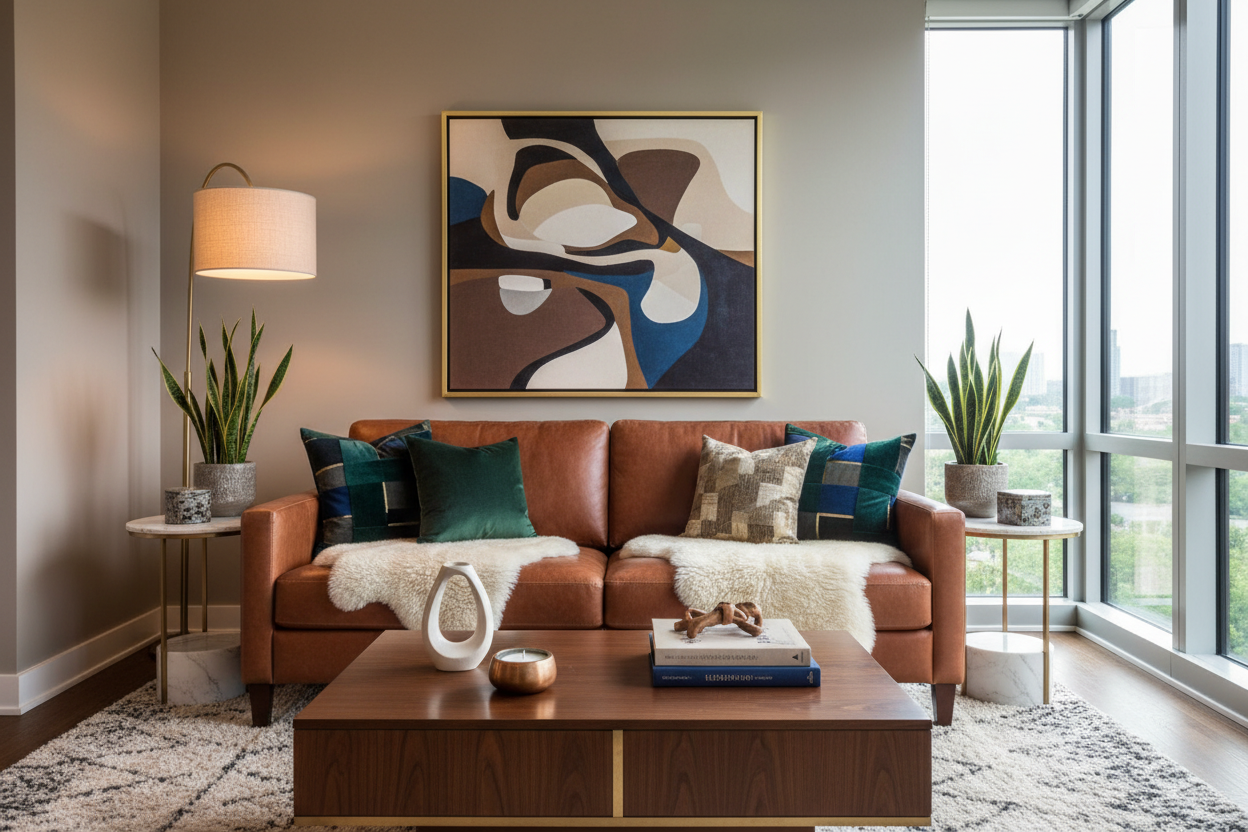
When curating diy office art, the material selection is paramount. It is not merely about what looks good; it is about how the texture interacts with the existing furniture finishes. If you have a sleek, glass-top desk, introduce warmth with organic textures like a framed textile or a wood-slat piece. Conversely, if your office is heavy on mahogany or walnut, a minimalist, high-contrast abstract piece on canvas provides necessary visual relief.
The Role of Texture and Acoustics
In modern offices, hard surfaces often create poor audio quality for conference calls. I often advise clients to treat their wall art as functional acoustic panels. Wrapping rigid insulation boards in breathable, high-GSM linen creates a piece that looks like a high-end color field painting but functions as a sound absorber. This dual purpose is the hallmark of intelligent design.
Composition and Visual Balance
The placement of your art is just as technical as the creation of it. A common error is hanging artwork too high, leaving it floating aimlessly in the vertical plane. The center of your piece should sit at eye level—approximately 57 to 60 inches from the floor if you are standing, but in an office, we must adjust for the seated position.
Anchoring the Space
Your artwork should act as a visual anchor. If you are creating a gallery wall, treat the entire arrangement as a single unit. Ensure the negative space between frames is consistent—usually 2 to 3 inches creates a cohesive look. This precision signals professionalism, whereas irregular spacing can subconsciously signal chaos or lack of attention to detail.
My Personal Take on DIY Wall Art for Office
I remember a project for a boutique law firm where the budget had been entirely consumed by Herman Miller seating. We had a massive, echoing conference room wall that looked terribly stark. I decided to create a large-scale triptych using drop cloths and joint compound to create a textured, plaster-like effect.
Here is the unpolished truth I learned from that installation: Weight distribution is everything. I used standard picture wire, which was a mistake. Because the joint compound added significant weight, the frames tilted forward slightly, catching the overhead recessed lighting in an unflattering way that highlighted every imperfection in the plaster. I had to go back and reinstall them using French cleats (a split batten system). This pulled the art flush against the wall, hiding the warp and making the pieces look built-in rather than hung. If you are doing heavy DIY art, skip the wire; go for the cleats.
Conclusion
Your workspace is a tool for success, and every element within it should serve a purpose. By crafting your own wall décor, you control the narrative of the room, balancing acoustics, aesthetics, and budget. Treat your walls with the same respect you treat your business—with intention, quality, and a touch of personal flair.
Frequently Asked Questions
How do I make DIY art look expensive?
The secret lies in the framing. Use oversized matting (white borders) and substantial frames. A small print with a wide 4-inch mat looks significantly more luxurious than a poster filling the whole frame.
What is the best size for art above a desk?
Ideally, the artwork should span between 60% and 75% of the desk's width. If the art is wider than the furniture, the room will feel top-heavy and unbalanced.
Can I use DIY art in a rented office space?
Absolutely. Focus on lightweight materials like canvas or foam core that can be mounted with heavy-duty adhesive strips, eliminating the need for drilling holes in the drywall.


Leave a comment
This site is protected by hCaptcha and the hCaptcha Privacy Policy and Terms of Service apply.